UI Design Function
Introduction
Section titled “Introduction”The UI Design function in SenseCraft HMI is the most powerful and flexible feature of the platform, allowing you to create custom interfaces, dashboards, and data visualizations. With Canvas, you can design beautiful displays that combine static elements with dynamic data from various sources, including device sensors, weather information, stock data, and more.
This comprehensive guide will walk you through using the UI Design function to create professional displays for your Seeed devices. From basic shapes and text to real-time data widgets and pre-made templates, you’ll learn everything you need to build customized interfaces that meet your specific needs.
This article will use the reTerminal E1002 as an example to explain how to use this feature on the SenseCraft HMI platform.
Getting Started with Canvas
Section titled “Getting Started with Canvas”Accessing the Canvas Function
Section titled “Accessing the Canvas Function”Step 1. Navigate to the SenseCraft HMI platform below.
Step 2. Connect your device or select an already paired device to use.
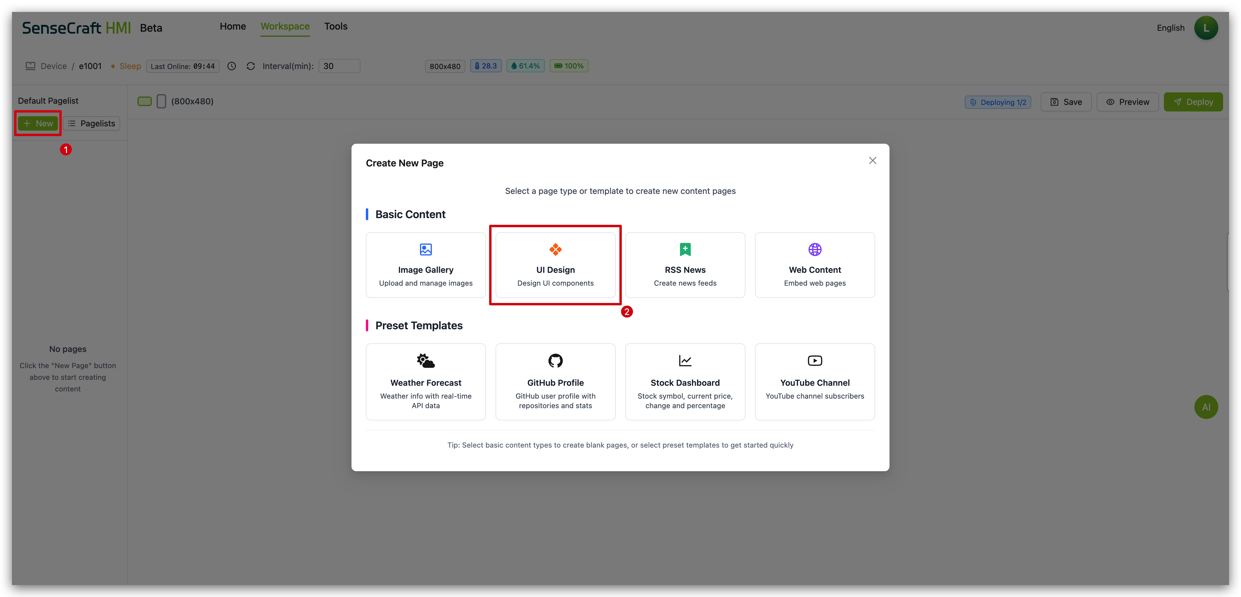
Step 3. If you haven’t created a page yet, you may need to create a new UI Design page first.
Understanding the Canvas Interface
Section titled “Understanding the Canvas Interface”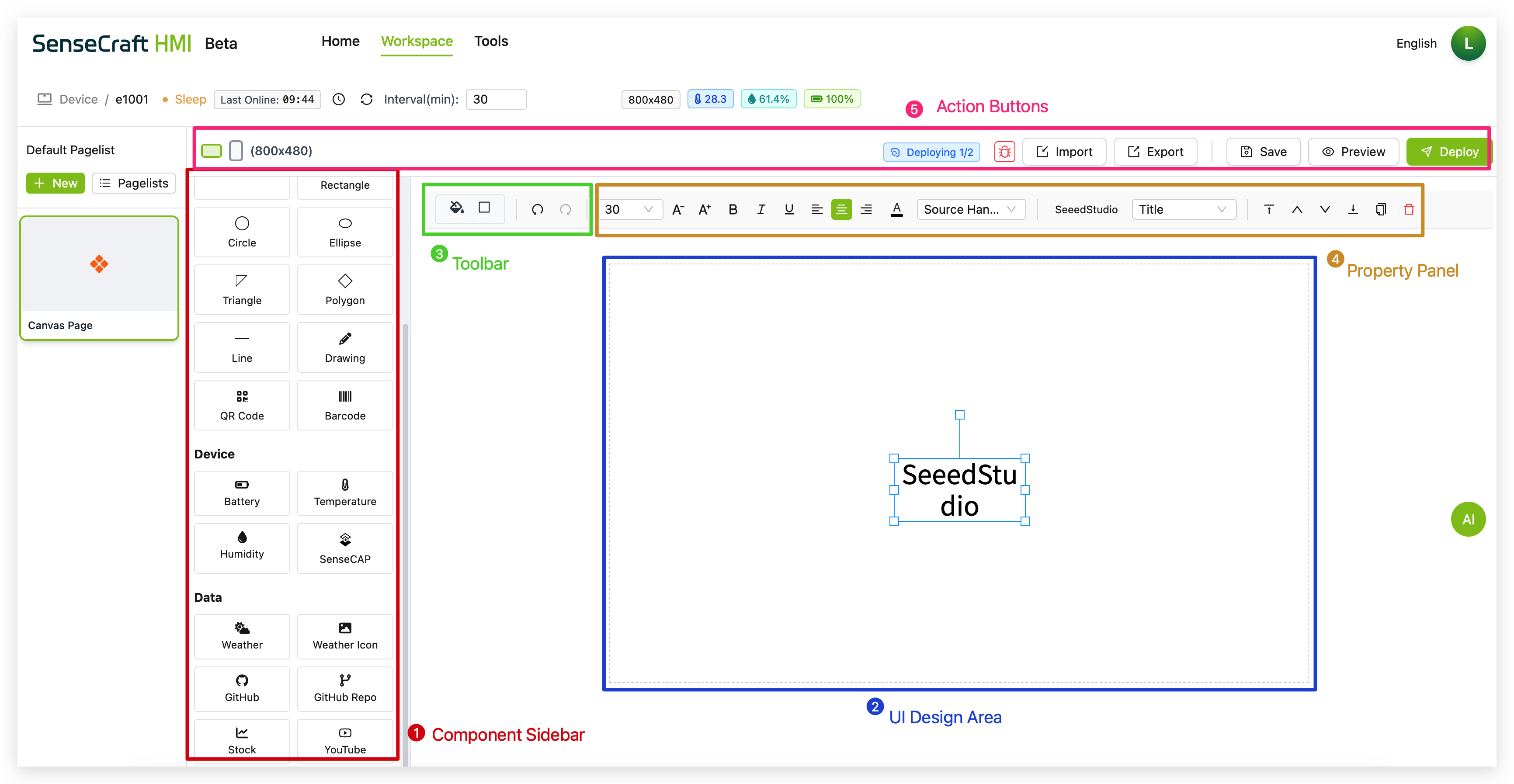
The Canvas interface consists of several key sections:
-
Component Sidebar: Left panel containing all available elements categorized into Basic, Device, Data, and Templates
-
UI Design Area: Central workspace where you design your interface
-
Toolbar: Top bar with design tools, settings, and formatting options
-
Property Panel: Appears when elements are selected, allowing customization of appearance and behavior
-
Action Buttons: Save, Preview, and Deploy buttons for testing and applying your design
Basic Components
Section titled “Basic Components”The Basic section provides fundamental elements for creating your interface layout:
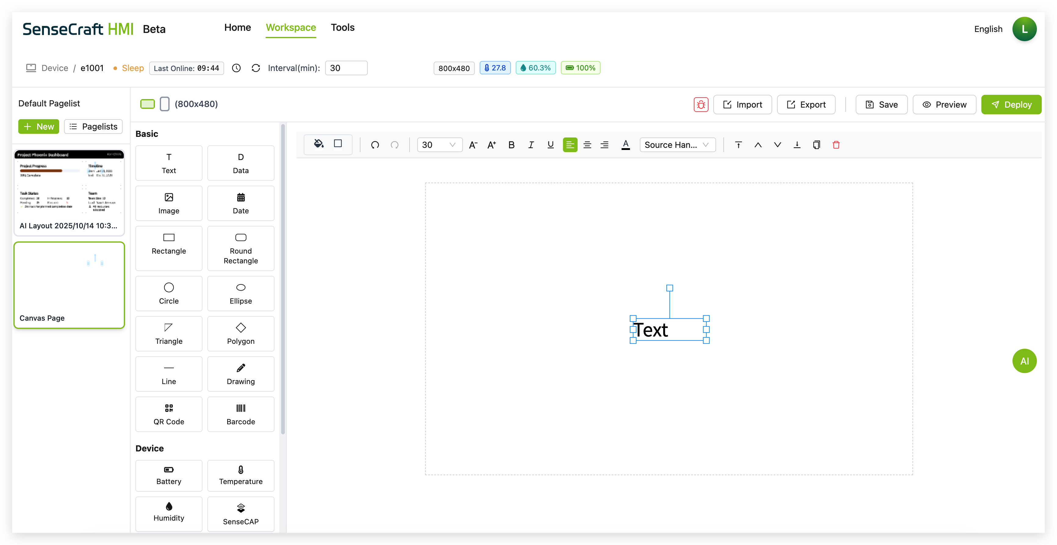
The Text component allows you to add labels, titles, and other text content to your canvas.
Step 1. Click on the “Text” component in the Basic section. The text is then automatically placed in the center of the canvas
Step 2. Drag the text to the area where you want to place it
Step 3. A default text box appears with the word “Text”
Step 4. Use the properties panel to customize:
-
Font size (default is 30px)
-
Text style (bold, italic, underline)
-
Alignment (left, center, right)
-
Color
-
Font family
The Data component is a powerful tool for displaying dynamic information fetched from external APIs directly on your canvas. This allows you to integrate real-time data such as weather, stock prices, or any other information available through a web API.
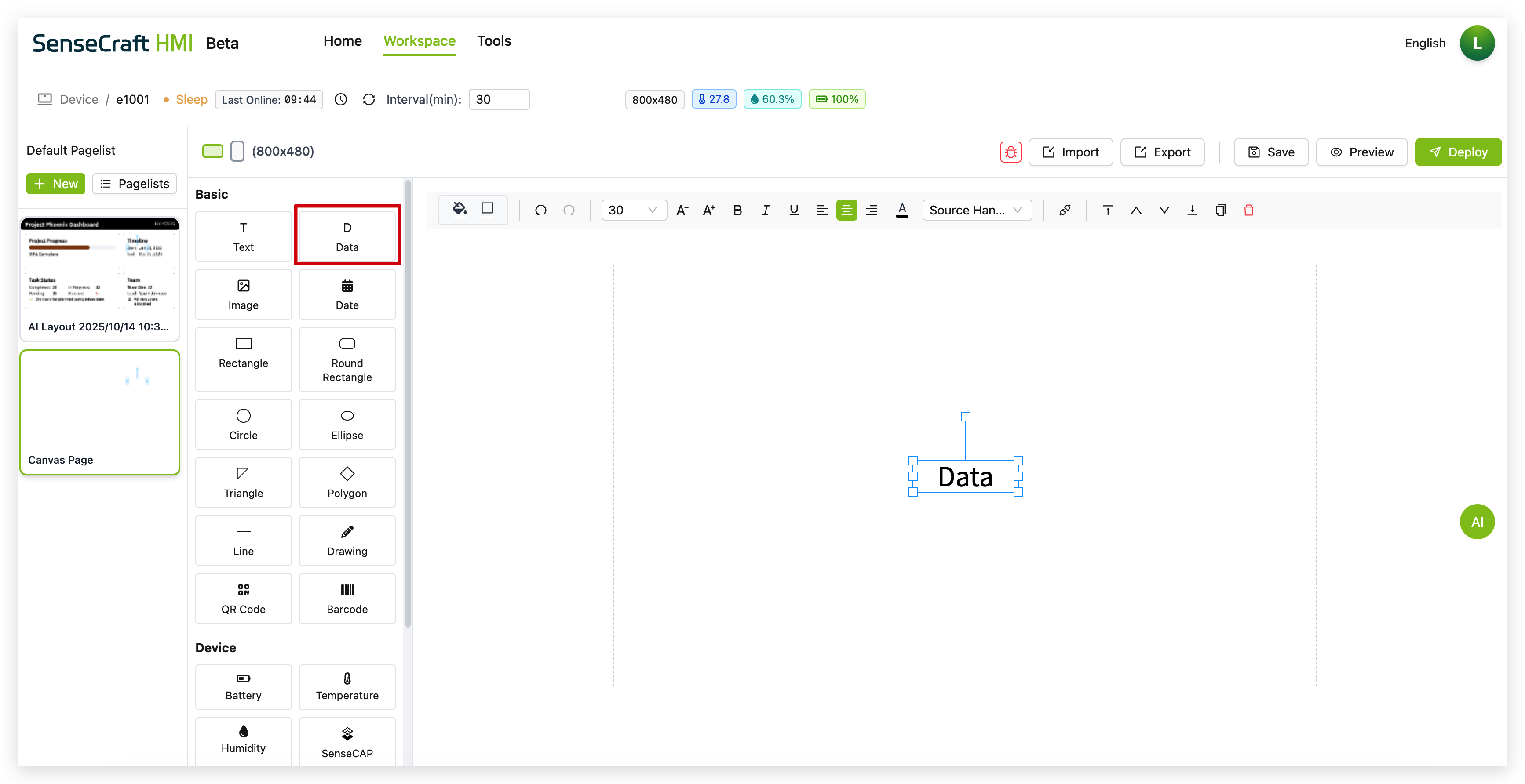
Step 1. Click on the “Data” component in the Basic section. A placeholder text box with the word “Data” will appear on the canvas.
Step 2. Drag the “Data” component to your desired position.
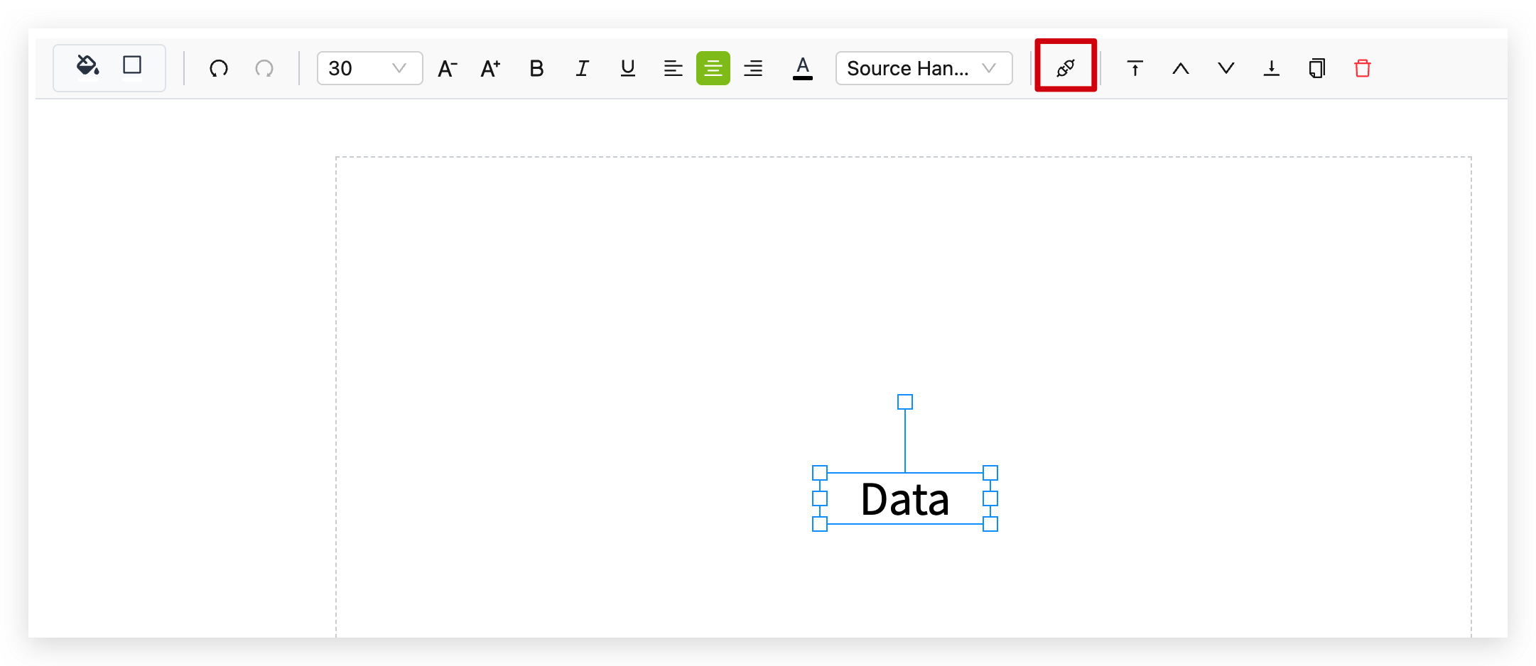
Step 3. With the component selected, click the Data Settings icon (it looks like a chain link) in the toolbar to open the configuration panel.
Step 4. In the Data Settings panel, configure your external data source:
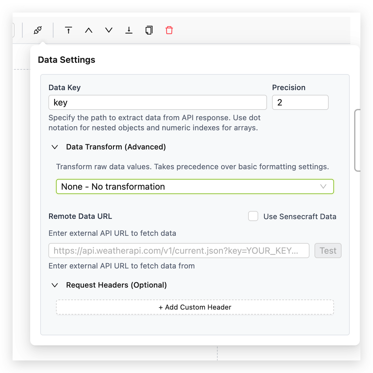
4.1. Establish the Connection
This is where you tell the component where to find its information.
- Remote Data URL: Input the full API endpoint URL here. For instance, if you’re building a stock ticker, you would enter the URL provided by your financial data API.
- Request Headers (Optional): Some APIs require authentication via headers. Use the + Add Custom Header button to add necessary keys and values, such as an
Authorizationtoken. - Test Button: After entering your URL, always use the Test button. This immediately queries the endpoint and shows you the raw JSON response. This is essential for verifying your connection and understanding the data structure you’ll be working with.
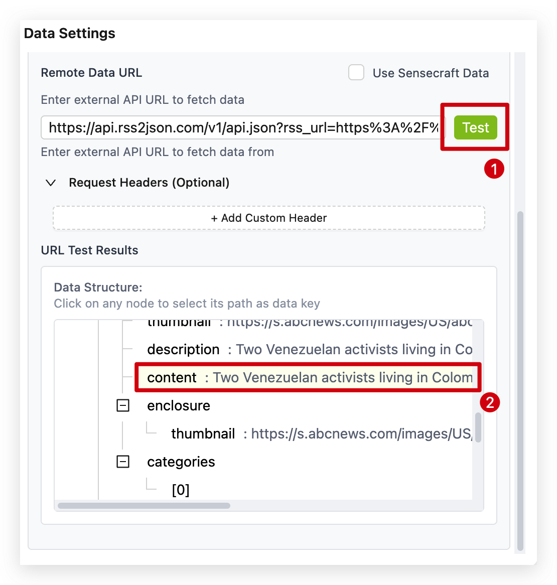
After clicking the Test button, if the URL is entered correctly, the console will immediately display all return values from the test results. At this point, you can click on the desired entry with your mouse to directly obtain the specific value.
4.2. Extract the Specific Value
An API response often contains a lot of data, but you usually only need one piece of it.
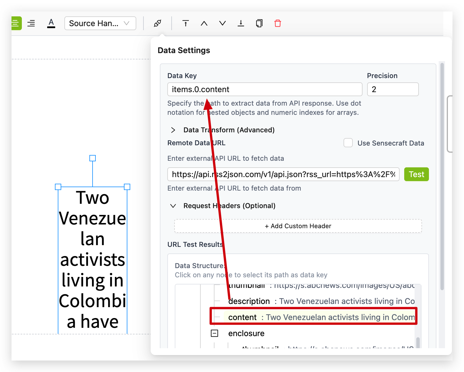
- Data Key: Use dot notation to specify the exact path to the data you want to display. If your API returns
{"stock":{"price": 150.75}}, your Data Key would bestock.priceto extract the price. For data in arrays, use bracket notation likeforecast[0].temperature. - Precision: For numerical data, this setting controls the number of decimal places to show. Setting it to
2will format150.7531as150.75.
4.3. Transform the Data for Display
This section is actually an independent module. It has no inherent connection to sections 4.1 and 4.2. It provides a set of predefined, potentially frequently used data values, allowing users to apply them directly without needing to locate the API themselves.
Here are the built-in transformers you can select:
- None - No transformation: Displays the raw, extracted value.
- Date Format: Converts a computer timestamp (e.g.,
1678886400) into a human-readable date (e.g., “2023-03-15”). - Custom Function: The ultimate tool for flexibility. Write your own JavaScript to manipulate the value. For example,
return '$' + value;would prefix a dollar sign to a stock price. - Weather Code to Description: A specialized function that translates numeric weather codes from an API into descriptive text like “Sunny” or “Rain.”
- Battery Level Status: Intelligently converts a percentage (0-100) into a status like “High,” “Medium,” or “Low.”
- Large Number Format: Automatically shortens large numbers for readability (e.g.,
1250000becomes “1.25M”). - Relative Time: Transforms a timestamp into a relative expression like “Updated 5 minutes ago,” making your data feel more immediate.
By combining these settings, you can precisely control how external data is fetched, interpreted, and presented on your canvas, creating a truly dynamic and informative display.
Step 5. You can also customize the appearance of the displayed data using the property panel to adjust:
- Font size and style
- Alignment
- Color
- Font family
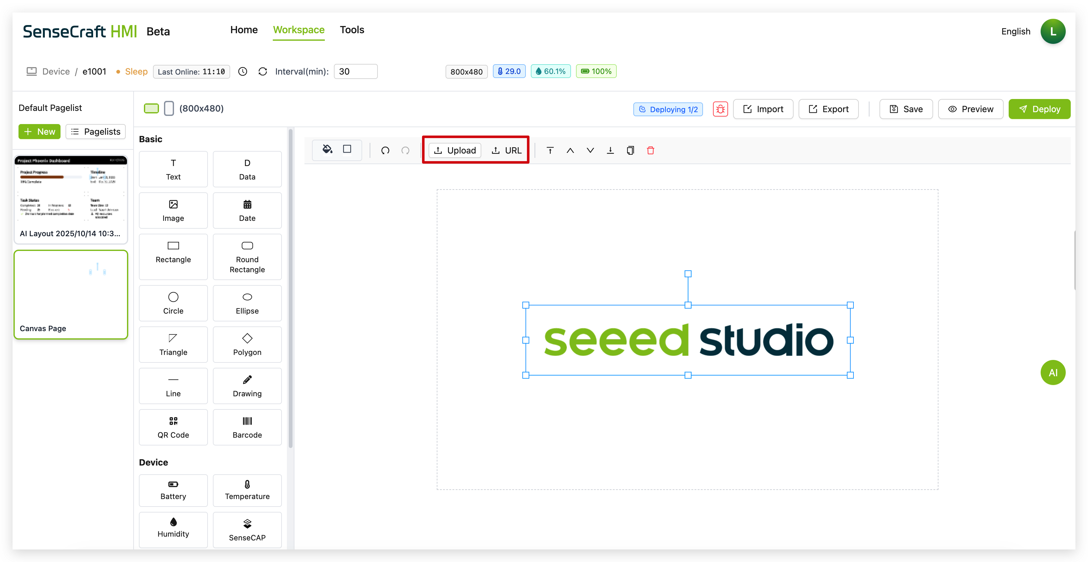
The Image component lets you add pictures to your canvas. You can choose to upload locally or use an image link.
Step 1. Click on the “Image” component
Step 2. In the properties panel, click “Upload” to add your image or enter an image URL
Step 3. Adjust the size and position as needed
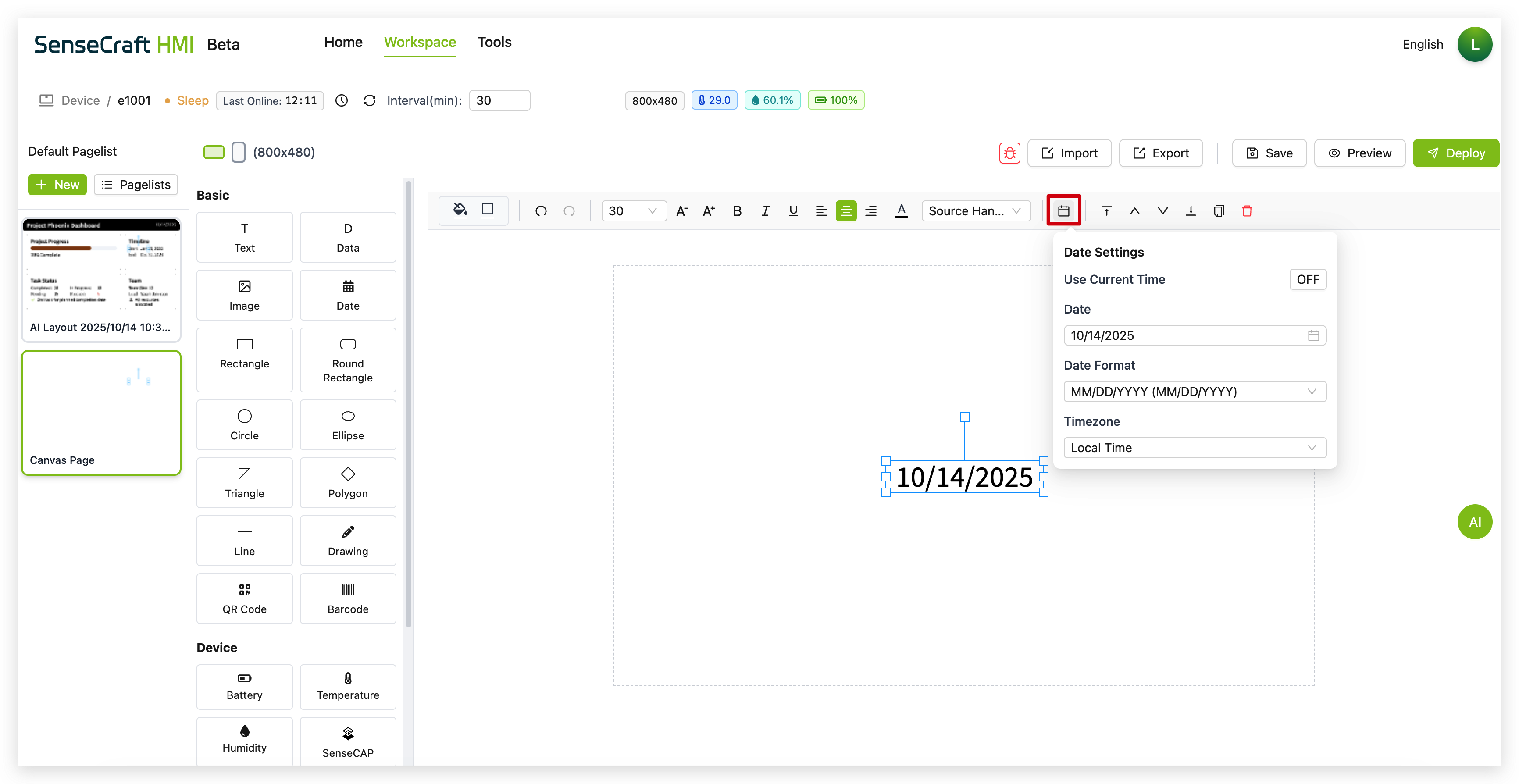
The Date component displays a date, time, or timestamp that can be configured in various formats.
Step 1. Click on the “Date” component in the Data section
Step 2. The component will automatically be placed in the center of your canvas with a default date format (usually MM/DD/YYYY)
Step 3. Click the calendar icon in the toolbar to open the Date Settings panel
Step 4. In the Date Settings panel:
-
Set a specific date using the date picker or input field
-
Select a date format from the dropdown menu (e.g., MM/DD/YYYY, DD/MM/YYYY, YYYY-MM-DD)
-
Select your time zone in the Timezone section.
Step 5. Use the property panel to further customize:
-
Font size and style
-
Text color
-
Alignment
-
Background (if desired)
Shapes
Section titled “Shapes”SenseCraft HMI Canvas offers various shape components:
-
Rectangle: Creates a standard rectangle or square
-
Round Rectangle: Creates a rectangle with rounded corners
-
Circle: Creates a perfect circle
-
Ellipse: Creates an oval shape
-
Triangle: Creates a three-sided shape
-
Polygon: Creates multi-sided shapes
-
Line: Creates straight lines
-
Drawing: Enables freehand drawing
For each shape:
Step 1. Click on the desired shape component
Step 2. Click and drag on the canvas to determine the final placement
Step 3. Use the properties panel to customize:
-
Fill color
-
Border color and width
-
Opacity
-
Corner radius (for rectangles)
-
Other shape-specific properties
QR Code
Section titled “QR Code”The QR Code component generates a scannable QR (Quick Response) code from any text or URL you provide.
Step 1. Click on the “QR Code” component in the Drawing section of the component list.
Step 2. The component will be placed on your canvas with a default QR code.
Step 3. Click the QR icon in the component’s toolbar to open the QR Code Content panel.
Step 4. In the content panel, enter the text or URL you wish to encode into the “QR Code Content” input field. The QR code on the canvas will update automatically as you type.
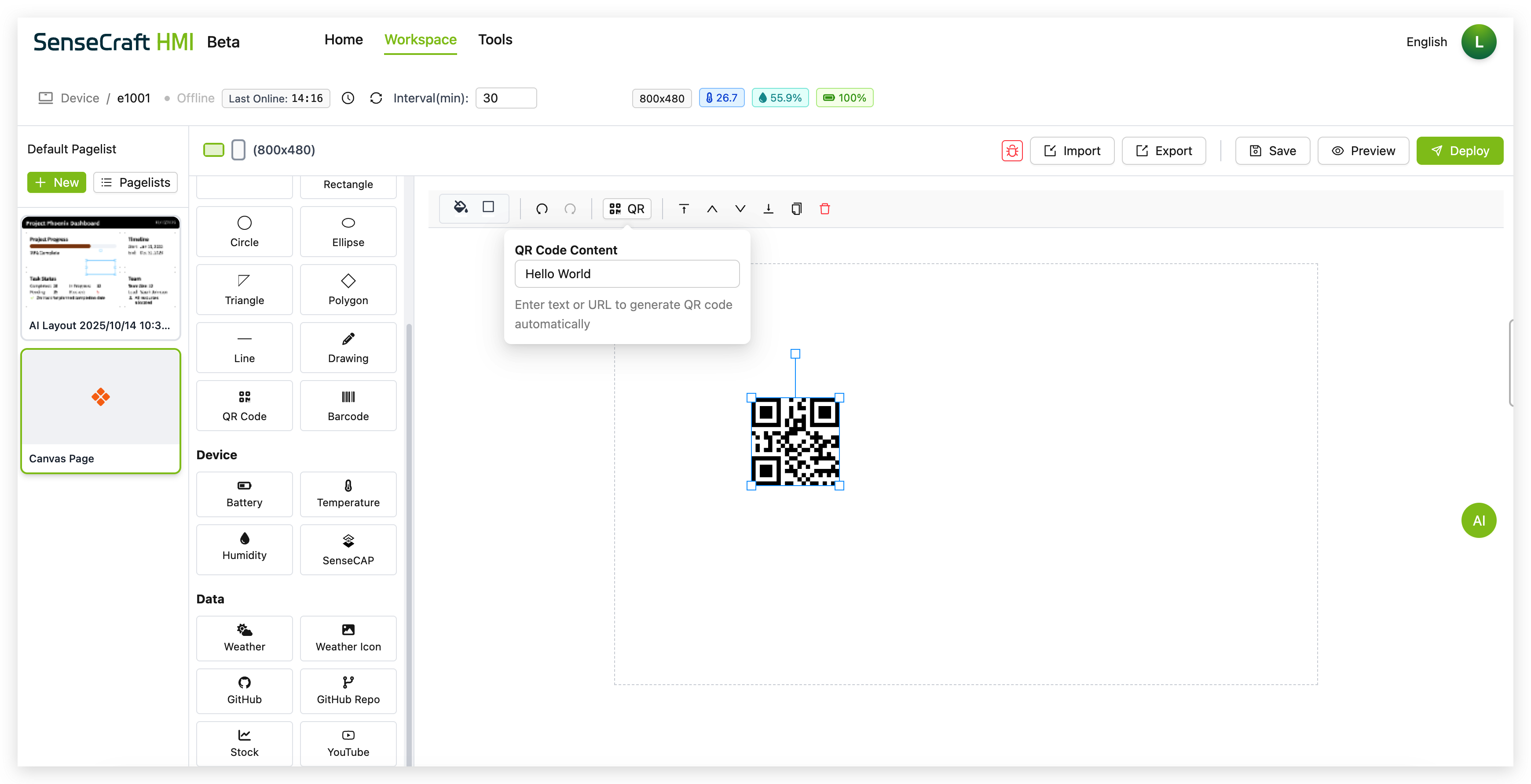
Step 5. Use the property panel to further customize the component’s size and position on the canvas.
Barcode
Section titled “Barcode”The Barcode component generates a standard scannable barcode from text or numbers.
Step 1. Click on the “Barcode” component in the Drawing section of the component list.
Step 2. The component will be placed on your canvas with a default barcode and its corresponding numbers displayed below.
Step 3. Click the Bar icon in the component’s toolbar to open the Barcode Content panel.
Step 4. In the content panel, enter the text or numbers you wish to encode into the “Barcode Content” input field. The barcode and the text beneath it will update automatically.
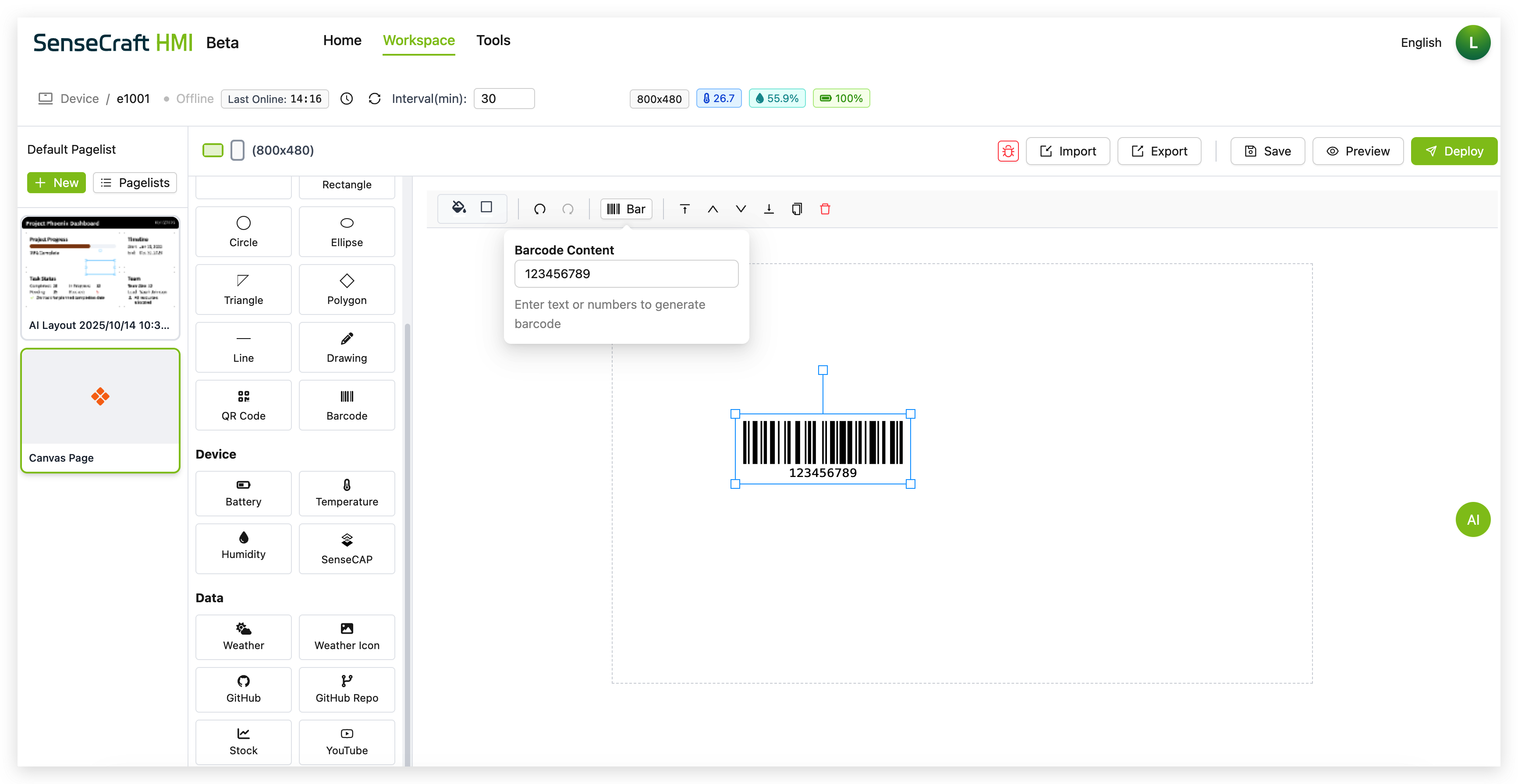
Step 5. Use the property panel to further customize the component’s size and position on the canvas.
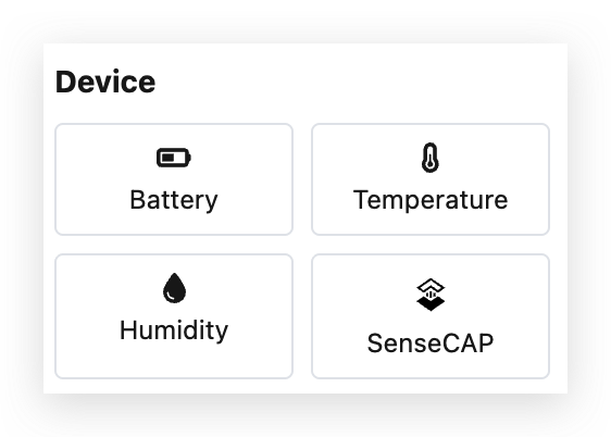
Device Components
Section titled “Device Components”The Device section contains components that automatically display data from your connected Seeed reTerminal E Series ePaper Display device sensors:
Battery Component
Section titled “Battery Component”The Battery component displays the current battery level of your connected device.
Step 1. Click on the “Battery” component
Step 2. The component will automatically show the battery percentage of your device
Step 3. Use the properties panel to customize:
-
Font size (default is 30px)
-
Text style (bold, italic, underline)
-
Alignment (left, center, right)
-
Color
-
Font family
Temperature Component
Section titled “Temperature Component”The Temperature component displays the current temperature reading from your device’s sensor.
Step 1. Click on the “Temperature” component
Step 2. The component will automatically show the temperature reading from your device
Step 3. Use the properties panel to customize:
-
Font size (default is 30px)
-
Text style (bold, italic, underline)
-
Alignment (left, center, right)
-
Color
-
Font family
Humidity Component
Section titled “Humidity Component”The Humidity component displays the current humidity reading from your device’s sensor.
Step 1. Click on the “Humidity” component
Step 2. The component will automatically show the humidity percentage from your device
Step 3. Use the properties panel to customize:
-
Font size (default is 30px)
-
Text style (bold, italic, underline)
-
Alignment (left, center, right)
-
Color
-
Font family
SenseCAP Component
Section titled “SenseCAP Component”If you have previously purchased a SenseCAP sensor, SenseCraft-HMI now supports directly retrieving sensor readings from SenseCAP nodes under your account.
Step 1. Click on the “SenseCAP” component
Step 2. Components will automatically be placed in the center of the canvas
Step 3. Please select the sensor values you wish to display in the Properties pane.
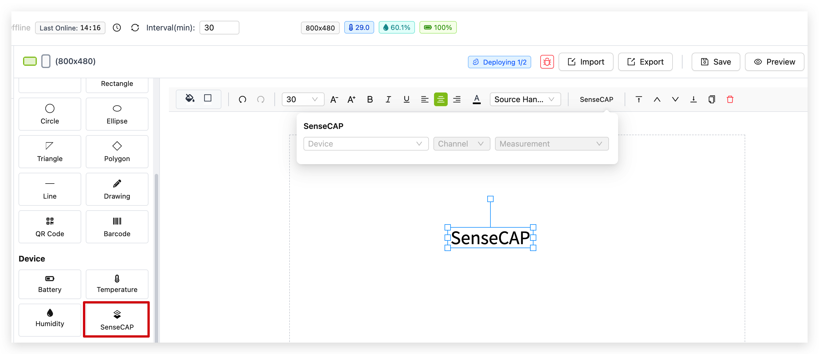
Step 4. Use the properties panel to customize:
-
Font size (default is 30px)
-
Text style (bold, italic, underline)
-
Alignment (left, center, right)
-
Color
-
Font family
Data Components
Section titled “Data Components”The Data section contains components that connect to external data sources to display information like weather, stocks, and more:
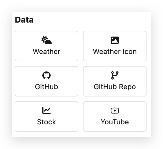
Weather
Section titled “Weather”The Weather component displays current weather information for a specified location.
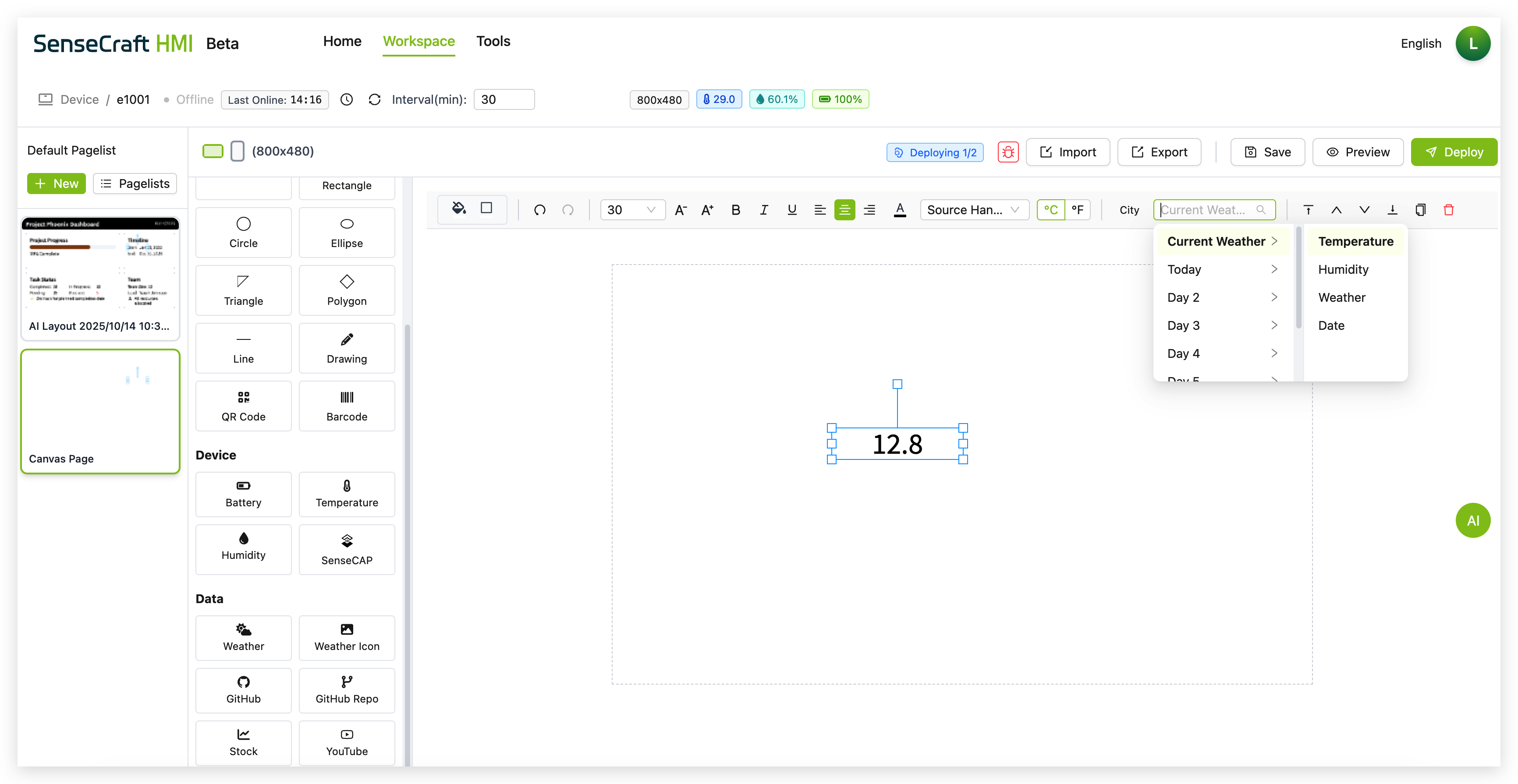
Step 1. Click on the “Weather” component in the Data section
Step 2. The component will automatically be placed in the center of your canvas with the default Temperature
Step 3. Using the toolbar at the top, configure the weather display options:
-
Select a location (e.g., “New York”) from the location field
-
Choose what weather data to display from the dropdown menu:
-
Current Weather (temperature, conditions)
-
Today (today’s forecast)
-
Day 2 through Day 7 (future forecasts)
-
Step 4. Use the property panel to further customize the appearance
Weather Icon
Section titled “Weather Icon”The Weather Icon component displays a visual representation of the current weather conditions.
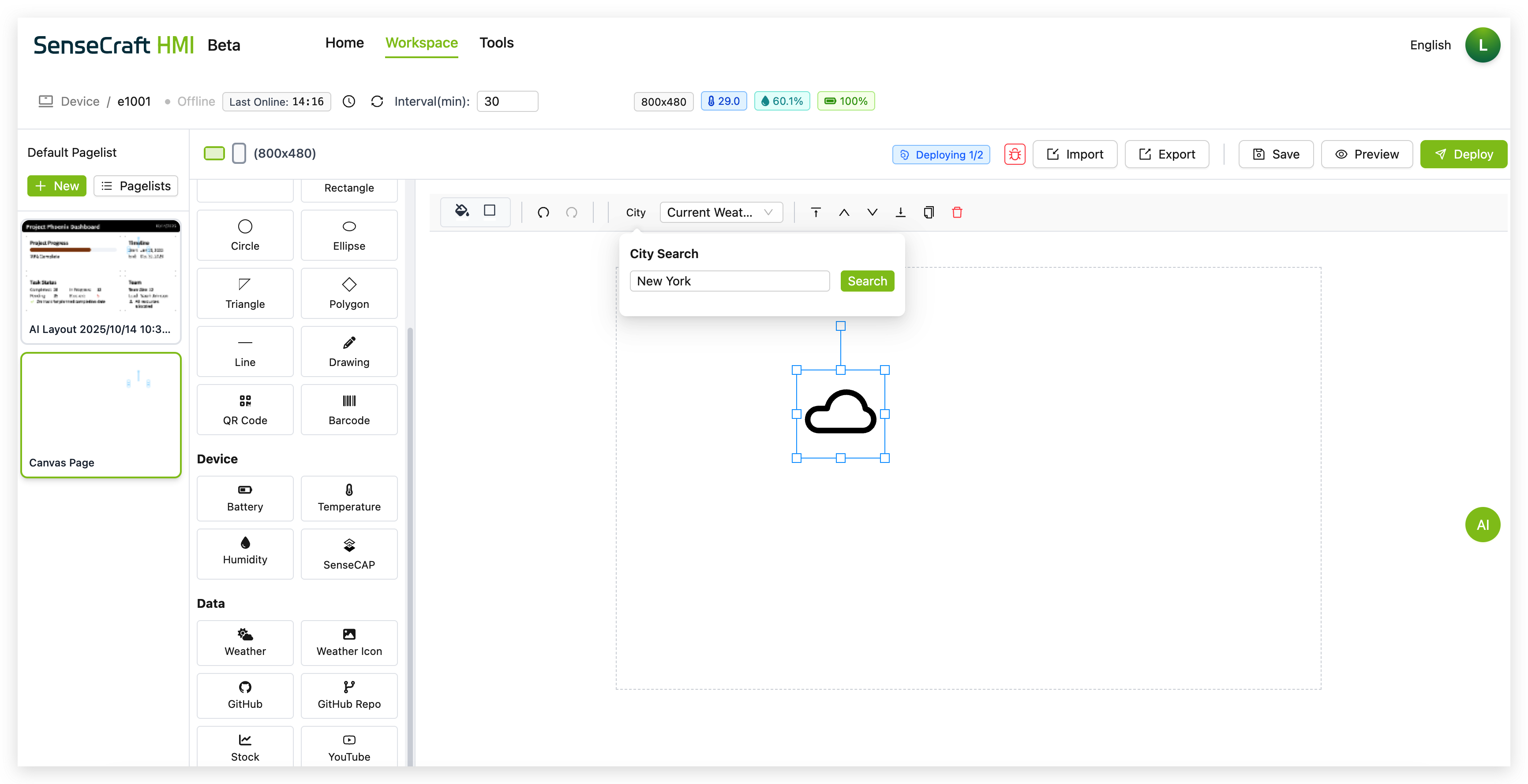
Step 1. Click on the “Weather Icon” component in the Data section
Step 2. The component will automatically be placed in the center of your canvas
Step 3. Using the toolbar at the top, select the location (e.g., “New York”) from the location field
Step 4. Use the property panel to customize:
- Size and position
- Icon style
GitHub
Section titled “GitHub”The GitHub component displays information about a GitHub user profile.
Step 1. Click on the “GitHub” component in the Data section
Step 2. The component will automatically be placed in the center of your canvas with default text showing “Seeed Studio”
Step 3. In the toolbar, you’ll see a GitHub username field (e.g., “seeed-studio”) and a dropdown menu
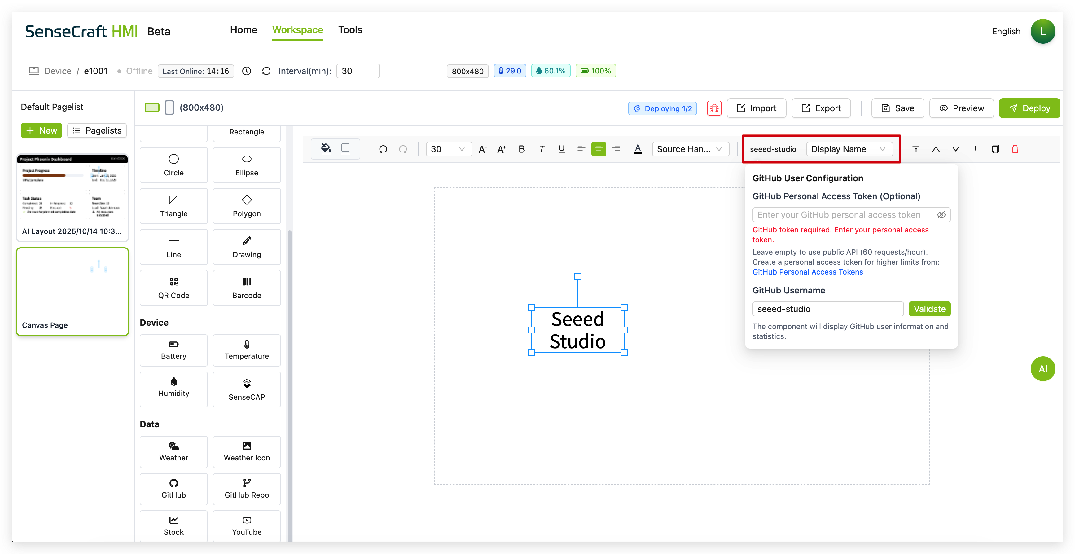
Step 4. Here, you need to request a Token from your GitHub account. SenseCraft HMI will use this Token to retrieve information related to the GitHub name you provided for display purposes. Then enter a valid GitHub username in the field and click “Validate” in the GitHub User Configuration panel that appears.
Step 5. From the dropdown menu labeled “Display Name” (or similar), select what GitHub user information you want to display:
-
Display Name (shows the user’s display name)
-
Username (shows the user’s GitHub handle)
-
Followers (shows the number of followers)
-
Following (shows the number of users being followed)
-
Public Repos (shows the number of public repositories)
-
Public Gists (shows the number of public gists)
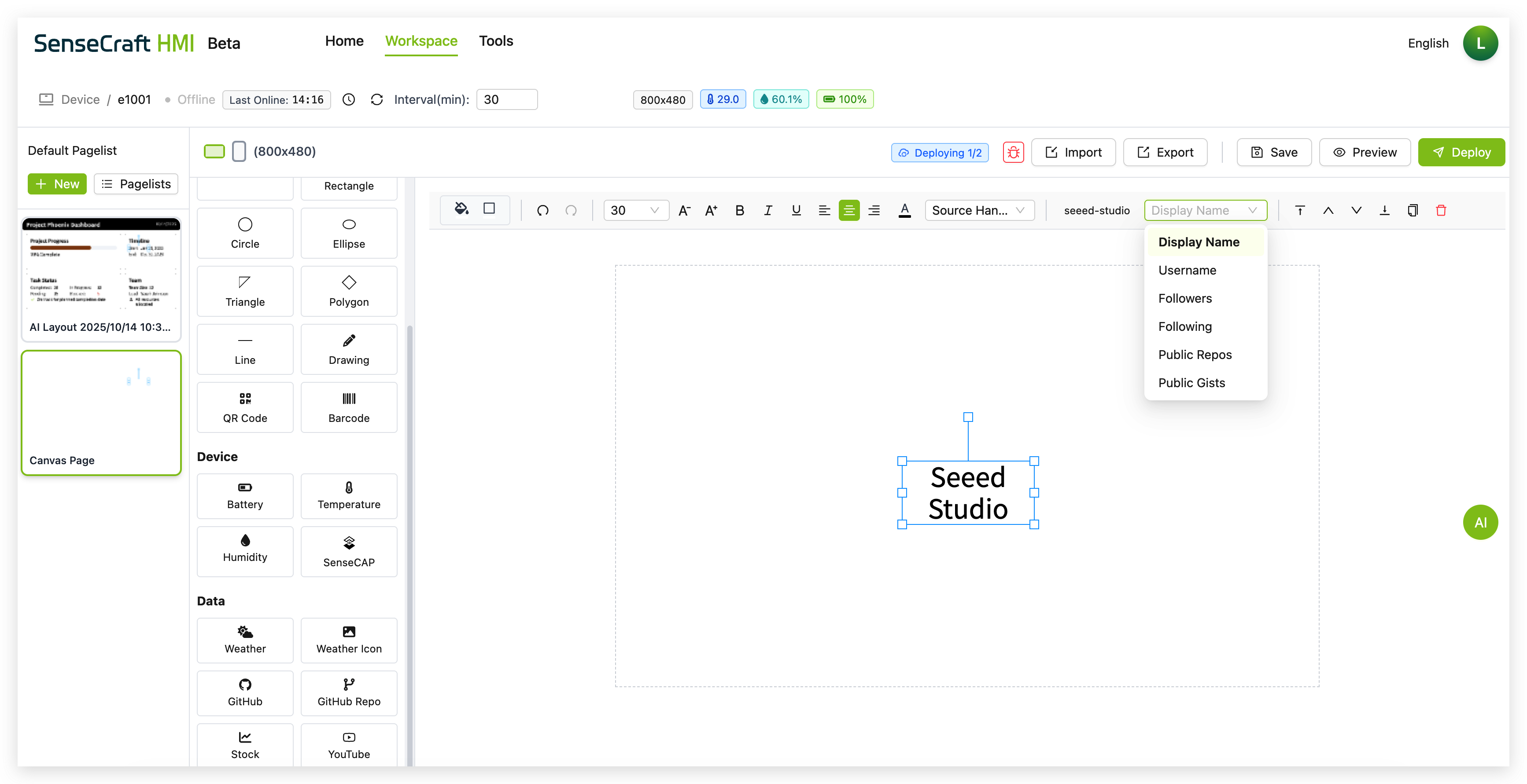
Step 6. Use the property panel to customize the appearance of the GitHub component
GitHub Repo
Section titled “GitHub Repo”The GitHub Repo component displays information about a specific GitHub repository.
Step 1. Click on the “GitHub Repo” component in the Data section
Step 2. The component will automatically be placed in the center of your canvas with default text showing “wiki-documents”
Step 3. In the GitHub Repository Configuration panel that appears:
-
You can see the current user and repository status
-
Search for repositories by entering keywords or leaving the field empty to show all repositories for a user
-
Manually enter a specific repository in the format “Username/Repository” (e.g., “Seeed-Studio/wiki-documents”)
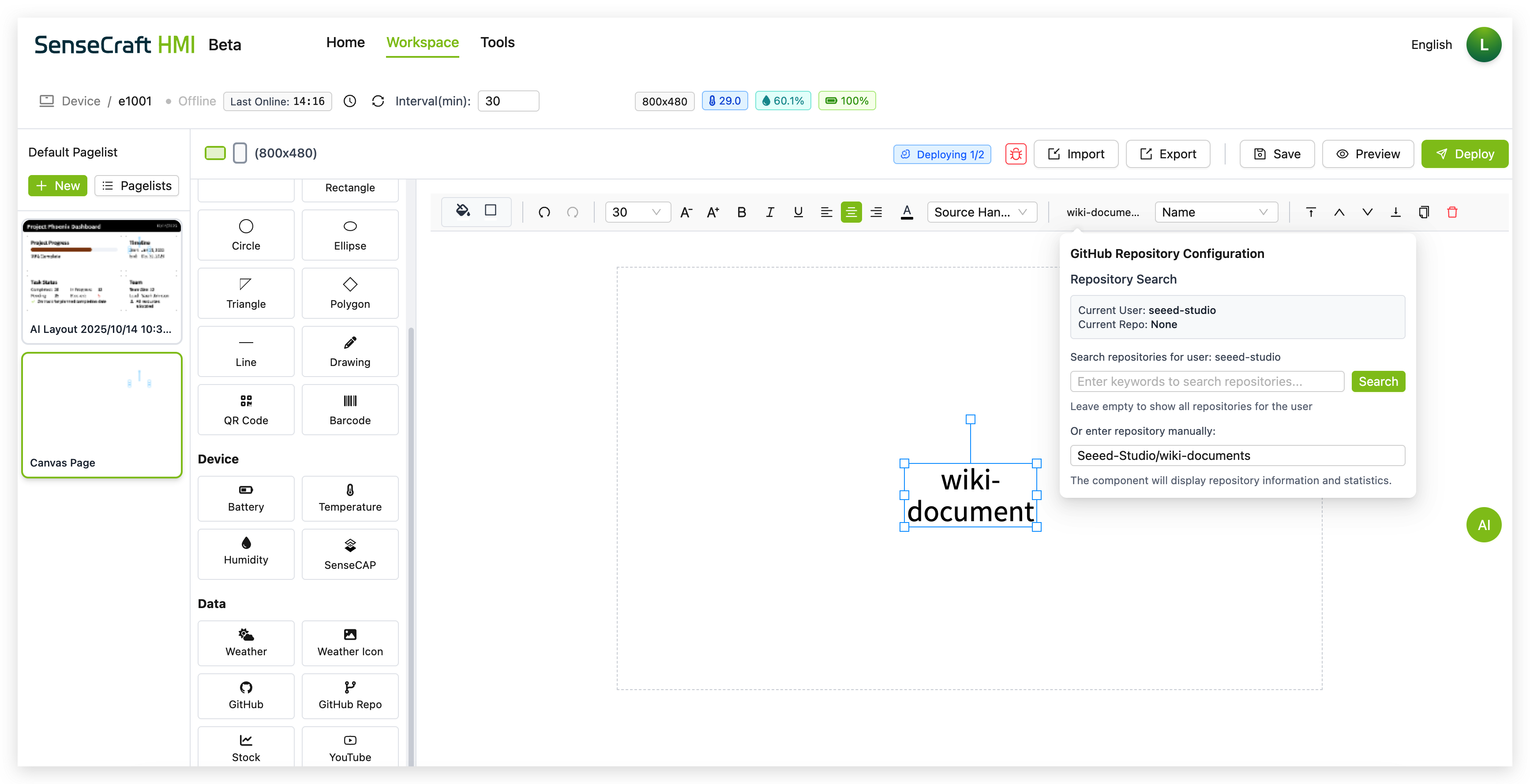
Step 4. Click “Search” to find and validate the repository
Step 5. From the dropdown menu in the toolbar, select what repository information you want to display:
-
Name (shows the repository name)
-
Full Name (shows the username/repository format)
-
Stars (shows the number of stars)
-
Forks (shows the number of forks)
-
Watchers (shows the number of watchers)
-
Description (shows the repository description)

Step 6. Use the property panel to customize the appearance of the GitHub Repo component
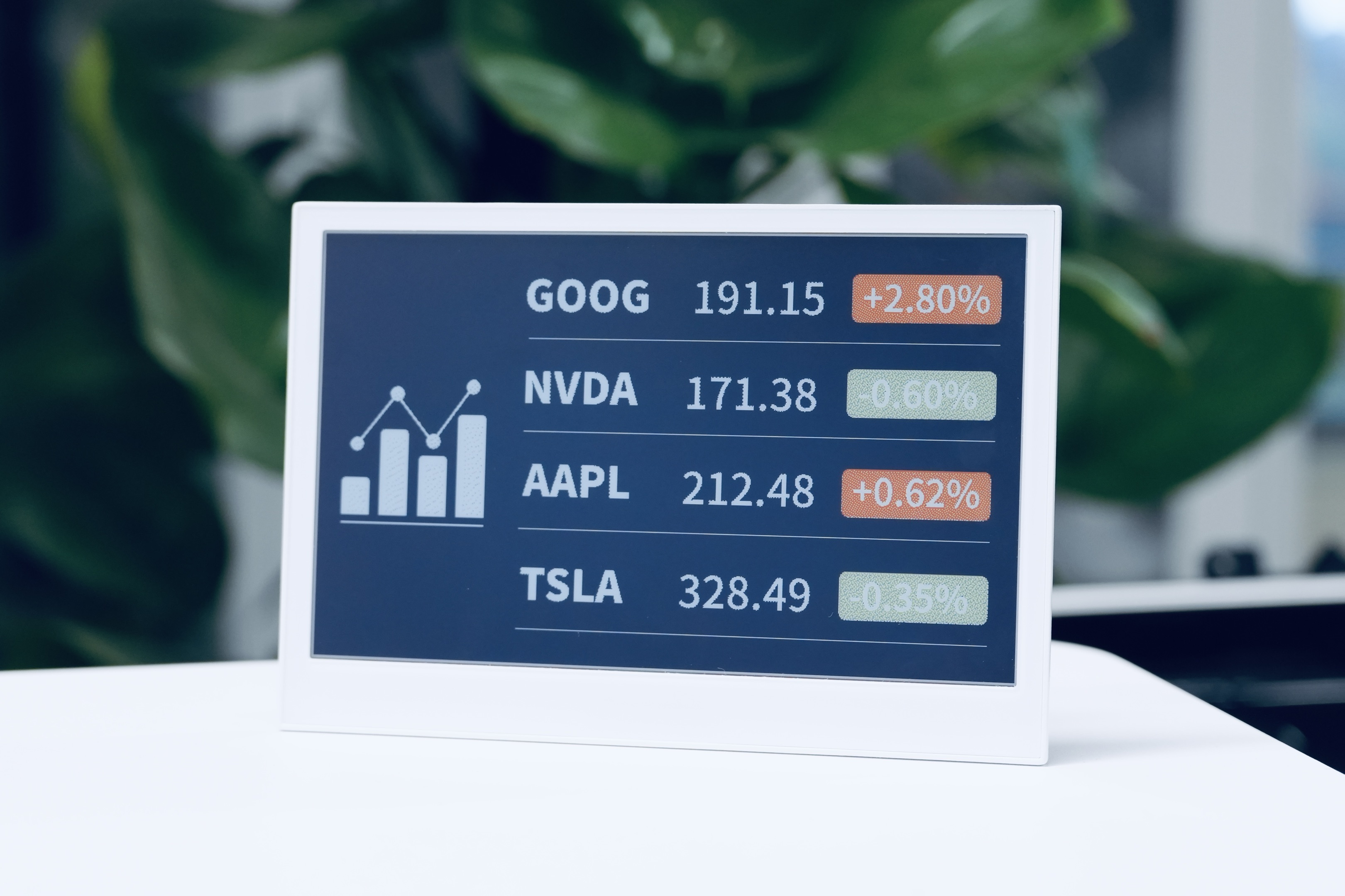
The Stock component displays real-time stock market information for specified symbols.
Step 1. Click on the “Stock” component in the Data section
Step 2. The component will automatically be placed in the center of your canvas with a default text “AAPL” (Apple’s stock symbol)
Step 3. Click the “Config” button in the toolbar to open the Stock Configuration panel
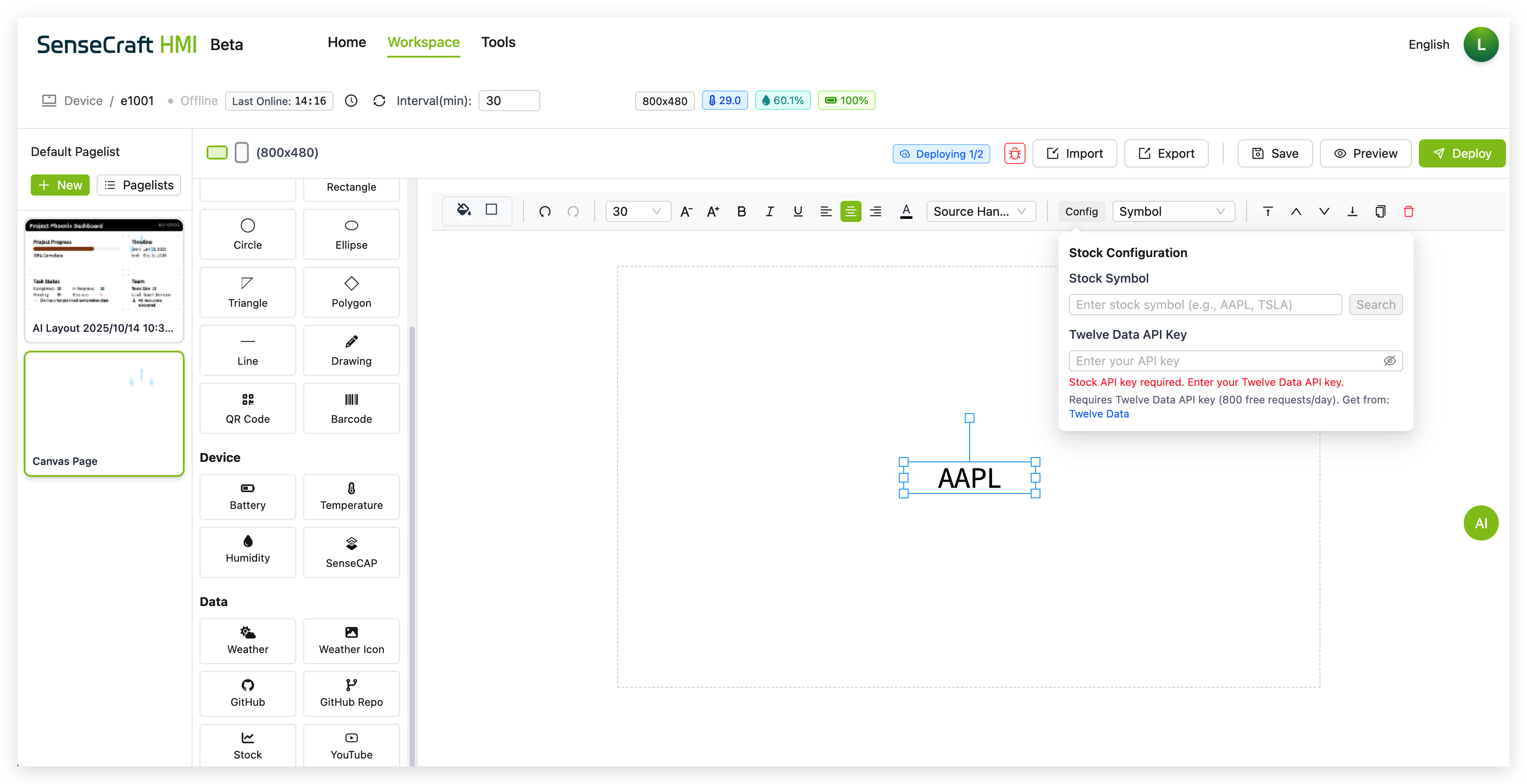
Step 4. In the Stock Configuration panel:
-
Enter a stock symbol (e.g., “AAPL”, “MSFT”, “GOOGL”) in the Stock Symbol field
-
Click “Search” to validate the symbol
-
Enter your Twelve Data API key in the provided field (You can refer to the tutorial below to learn how to obtain the API)
Step 5. From the “Symbol” dropdown menu in the toolbar, select what stock data to display:
-
Symbol (just shows the stock ticker symbol)
-
Current Price (shows the latest stock price)
-
Change (shows the price change since previous close)
-
Change Percent (shows the percentage change)
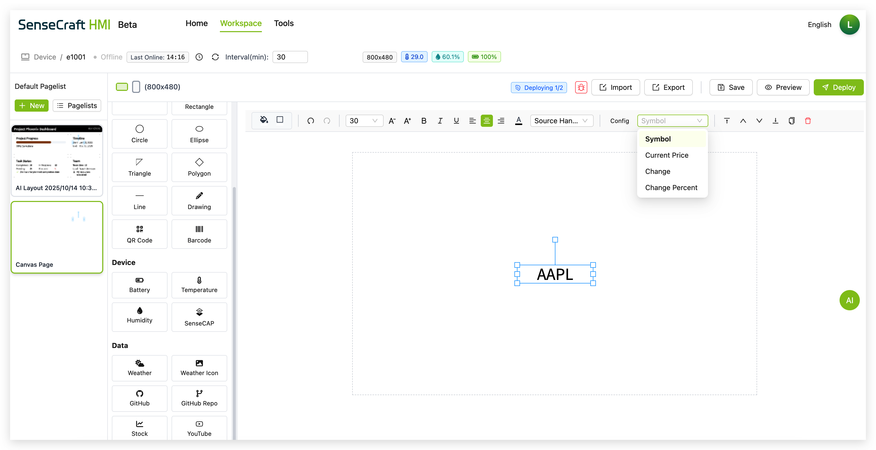
Step 6. Use the property panel to customize the appearance of the stock component
Getting a Twelve Data API Key
Section titled “Getting a Twelve Data API Key”To use the Stock component, you’ll need a free API key from Twelve Data:
Step 1. Visit twelvedata.com
Step 2. Click on “Get Started Free” or “Sign Up”
Step 3. Create an account with your email address and password
Step 4. Once registered and logged in, navigate to your dashboard
Step 5. Locate and copy your API key
Step 6. Paste this API key into the “Twelve Data API Key” field in the Stock Configuration panel
YouTube
Section titled “YouTube”The YouTube component displays information and statistics about a YouTube channel.
Step 1. Click on the “YouTube” component in the Data section
Step 2. The component will automatically be placed in the center of your canvas with default text showing “SeeedStudio”
Step 3. In the YouTube Configuration panel that appears:
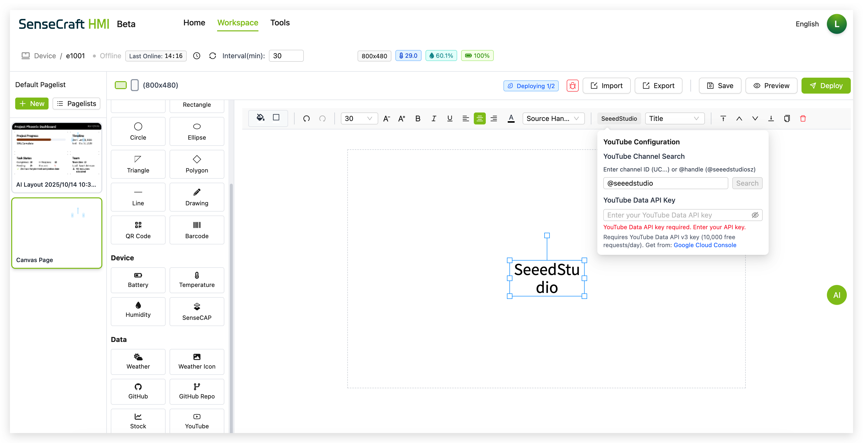
-
Enter a YouTube Channel ID (e.g., “UC_x5XG1OV2P6uZZ5FSM9Ttw”) in the YouTube Channel field
-
Click “Search” to validate the channel
-
Enter your YouTube Data API Key in the provided field
-
Click the “Google Cloud Console” link to get a free API key if you don’t have one
Step 4. From the dropdown menu in the toolbar, select what channel information you want to display:
-
Channel Name (shows the YouTube channel name)
-
Channel ID (shows the YouTube channel ID)
-
Description (shows the channel description)
-
Subscribers (shows the subscriber count)
-
Views (shows the total view count)
-
Videos (shows the number of uploaded videos)
-
Published At (shows the channel creation date)
-
Custom URL (shows the custom URL if available)

Step 5. Use the property panel to customize the appearance of the YouTube component
Getting a YouTube Data API Key
Section titled “Getting a YouTube Data API Key”To use the YouTube component, you’ll need a free API key from Google Cloud Console:
Step 1. Visit Google Cloud Console
Step 2. Create a new project or select an existing one
Step 3. Navigate to “APIs & Services” > “Library”
Step 4. Search for “YouTube Data API v3” and enable it
Step 5. Go to “APIs & Services” > “Credentials”
Step 6. Click “Create Credentials” > “API Key”
Step 7. Copy your new API key
Step 8. Paste this API key into the “YouTube Data API Key” field in the YouTube Configuration panel
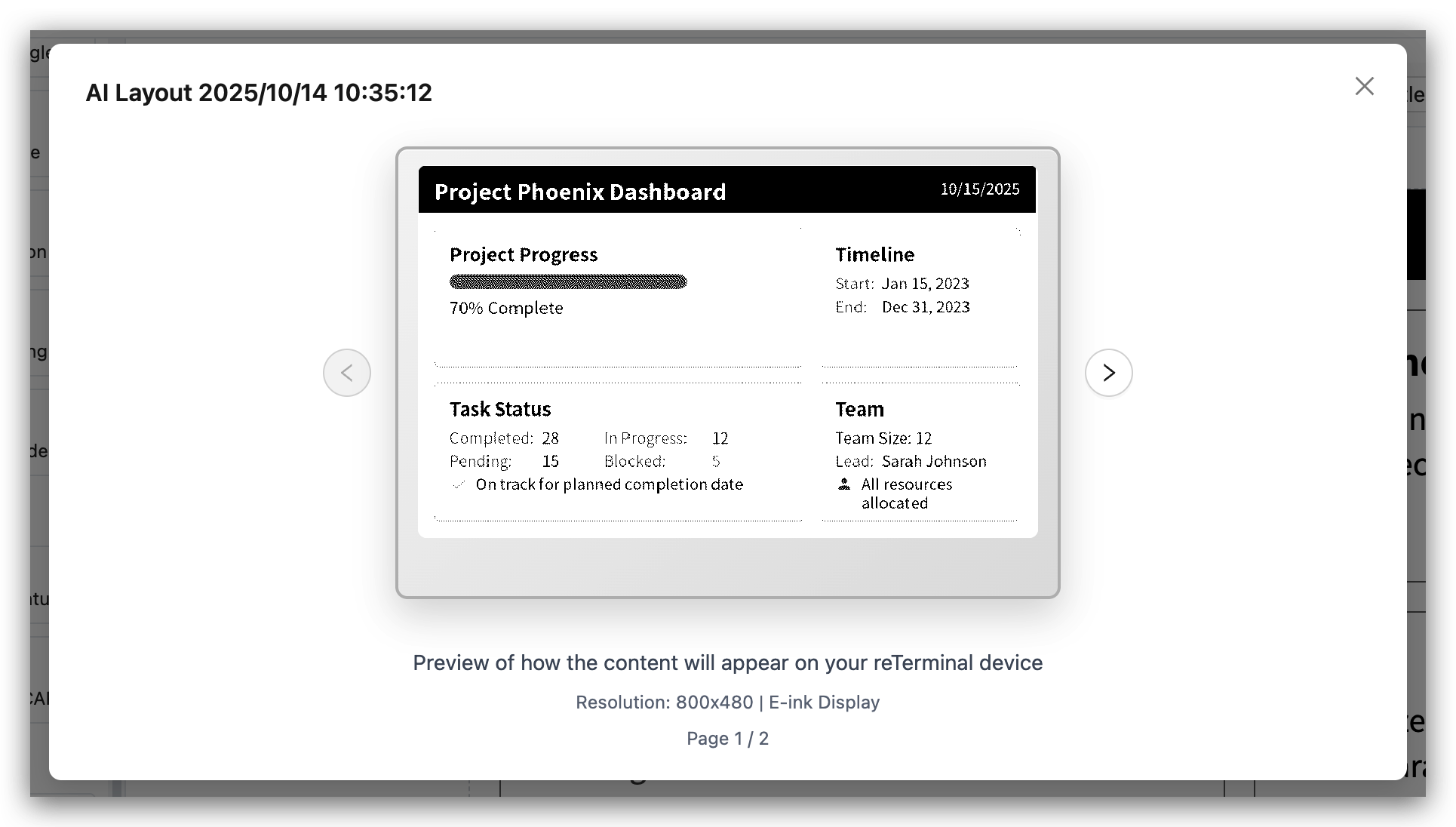
AI Layout Generator
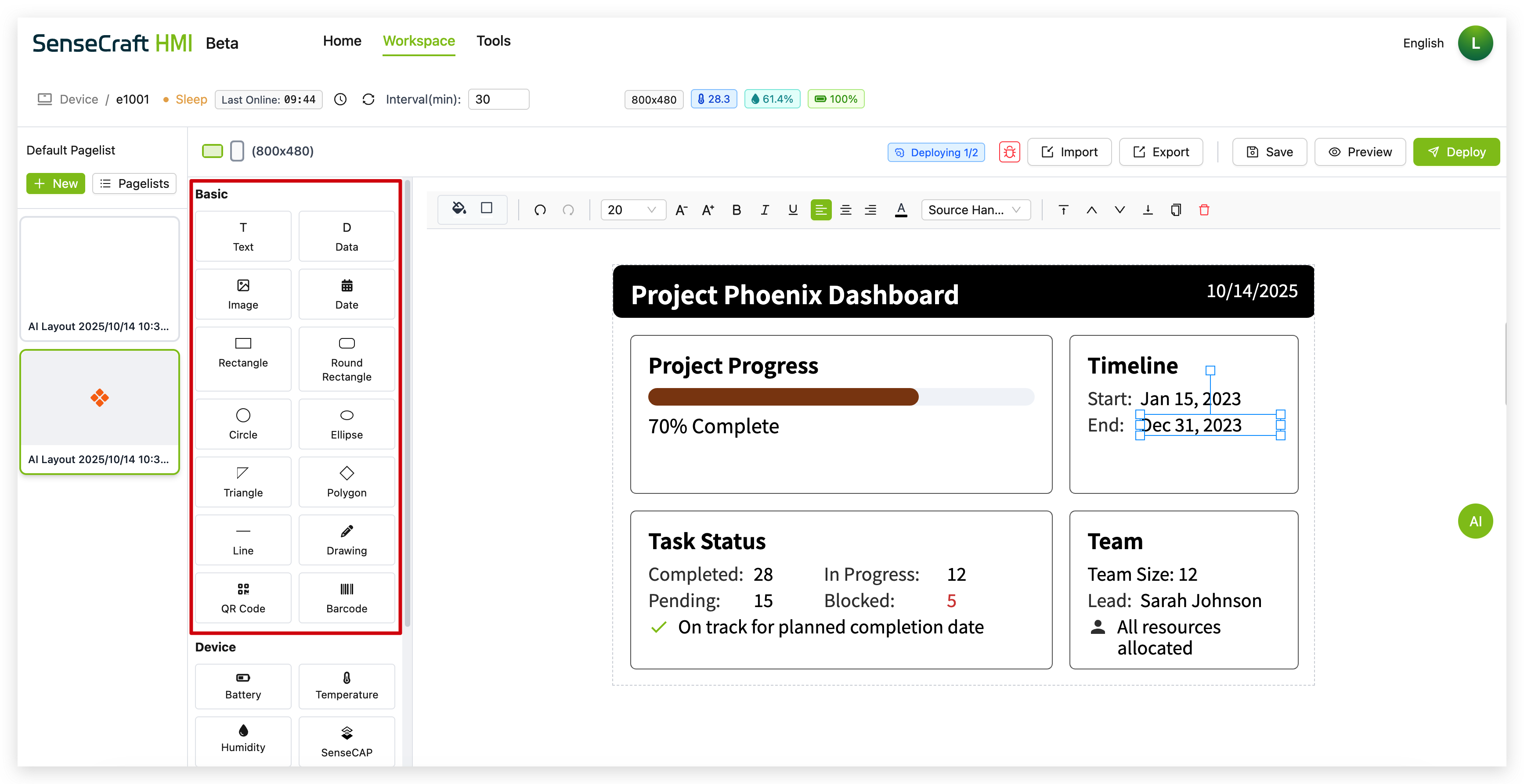
Section titled “AI Layout Generator”SenseCraft HMI Canvas includes an AI-powered layout generator:
Step 1. Click on the “AI Generator” button in the top right
Step 2. Enter a description of the layout you want to create
Step 3. Click “Generate” to have the AI create a layout based on your description
Step 4. Customize the generated layout as needed
This feature is excellent for quickly creating layouts without starting from scratch.
Deploying to Your Device
Section titled “Deploying to Your Device”Once you’ve created your canvas design, you’ll want to deploy it to your Seeed device:
Preview Before Deployment
Section titled “Preview Before Deployment”Step 1. Click the “Preview” button in the top toolbar
Step 2. Review how your layout will appear on the device
Step 3. Make any necessary adjustments
Save Your Layout
Section titled “Save Your Layout”Step 1. Click the “Save” button to store your current layout
Step 2. Your layout will be saved to the SenseCraft HMI cloud
Deploy to Device
Section titled “Deploy to Device”Step 1. Ensure your device is connected and shows “Online” status
Step 2. Click the “Deploy” button
Step 3. Wait for the deployment process to complete
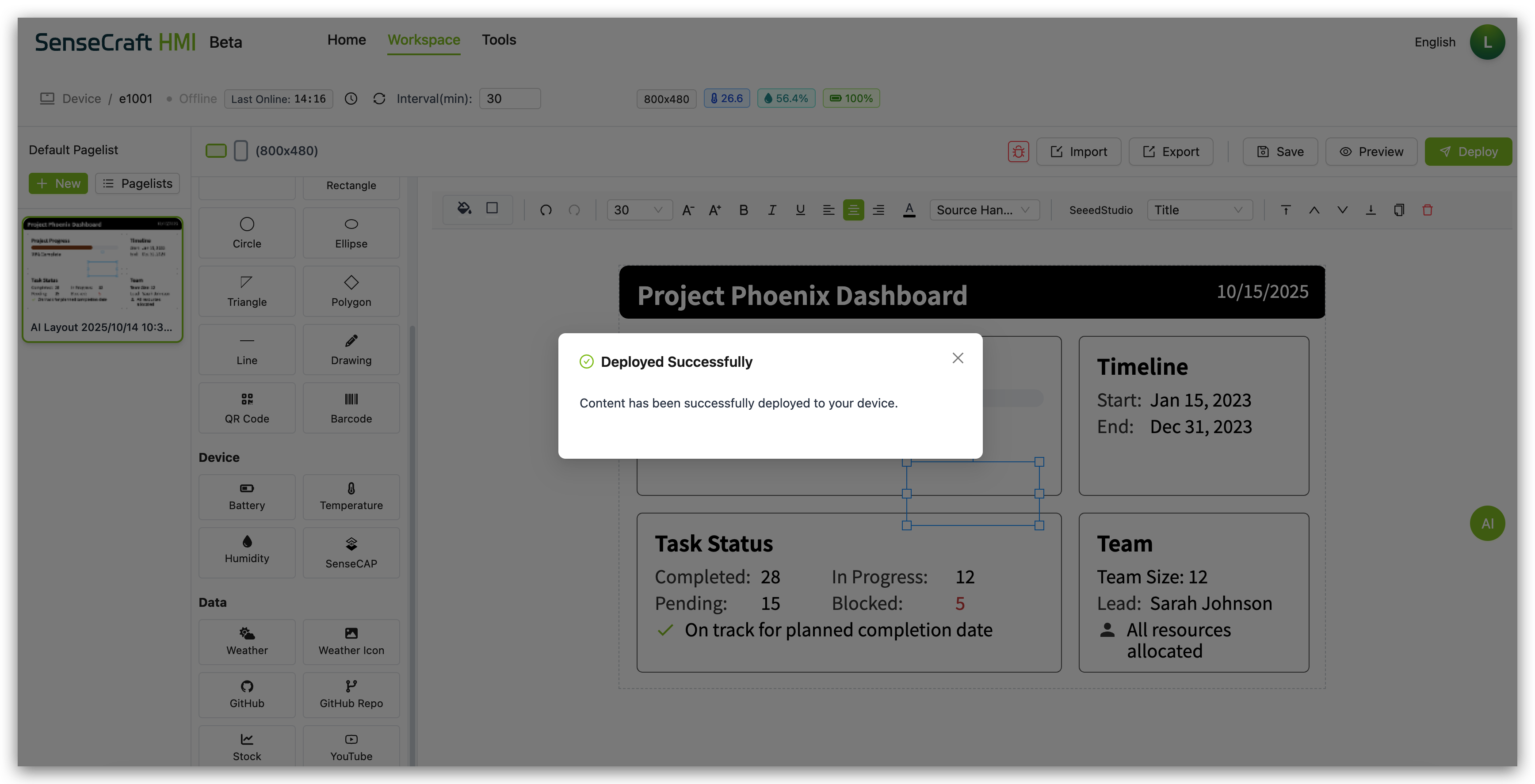
Step 4. Your layout will appear on your connected device
Deployment Considerations
Section titled “Deployment Considerations”For successful deployment to Seeed devices:
-
Device Compatibility: Ensure your layout is optimized for your specific device’s screen resolution
-
Connection Status: Make sure your device shows “Online” status before deploying
-
Data Components: If using data components (Weather, Stock, etc.), ensure your device has internet connectivity
-
Device Sensors: Components like Battery, Temperature, and Humidity will only work with compatible Seeed reTerminal E Series ePaper Display devices that have the appropriate sensors
-
Refresh Rate: Set an appropriate interval time based on how frequently your data needs updating and your device’s capabilities
Troubleshooting
Section titled “Troubleshooting”Common Canvas Issues and Solutions
Section titled “Common Canvas Issues and Solutions”-
Components not displaying data:
- Check your device’s internet connection
- Verify that the data source is available
- Ensure the data key path is correct for dynamic components
- Try refreshing the canvas or redeploying
-
Layout issues on device:
- Use the Preview function to test before deployment
- Avoid placing elements too close to the edges of the canvas
-
Deployment fails:
- Ensure your device is properly connected to SenseCraft HMI
- Check your device’s internet connection
- Try saving your layout and then deploying again
- Restart your device and try deploying again
-
Device sensor data not showing:
- Verify that your device has the required sensors
- Check that your device’s firmware is up to date
- Make sure the device is properly connected to SenseCraft HMI
-
Text or images appear distorted:
- Adjust the size and position of the components
- Check font settings for text components
- For images, ensure they have an appropriate resolution for your display
Conclusion
Section titled “Conclusion”The Canvas function in SenseCraft HMI provides a powerful platform for creating custom interfaces and dashboards for your Seeed devices. By combining basic design elements with dynamic data components and pre-made templates, you can create professional-looking displays that serve a wide range of purposes.
Whether you’re building a weather station, device monitor, information display, or control panel, Canvas gives you the tools to bring your vision to life. The intuitive drag-and-drop interface combined with advanced features like dynamic data binding and debugging tools makes it accessible to beginners while still offering the depth that experienced users need.