Canvas Designer
This section shows you how to use the Canvas Designer to create designs. We will first walk through the interface layout, then build a simple design step by step, and finally introduce the function of each widget to help you get started more smoothly.
Get to Know the Canvas Designer
Section titled “Get to Know the Canvas Designer”When you first open the Canvas Designer, it helps to think of it as five main areas: the Sidebar, Top Toolbar, Inspector Panel, canvas actions, and canvas settings. Once you know what each area is for, building designs becomes much easier.
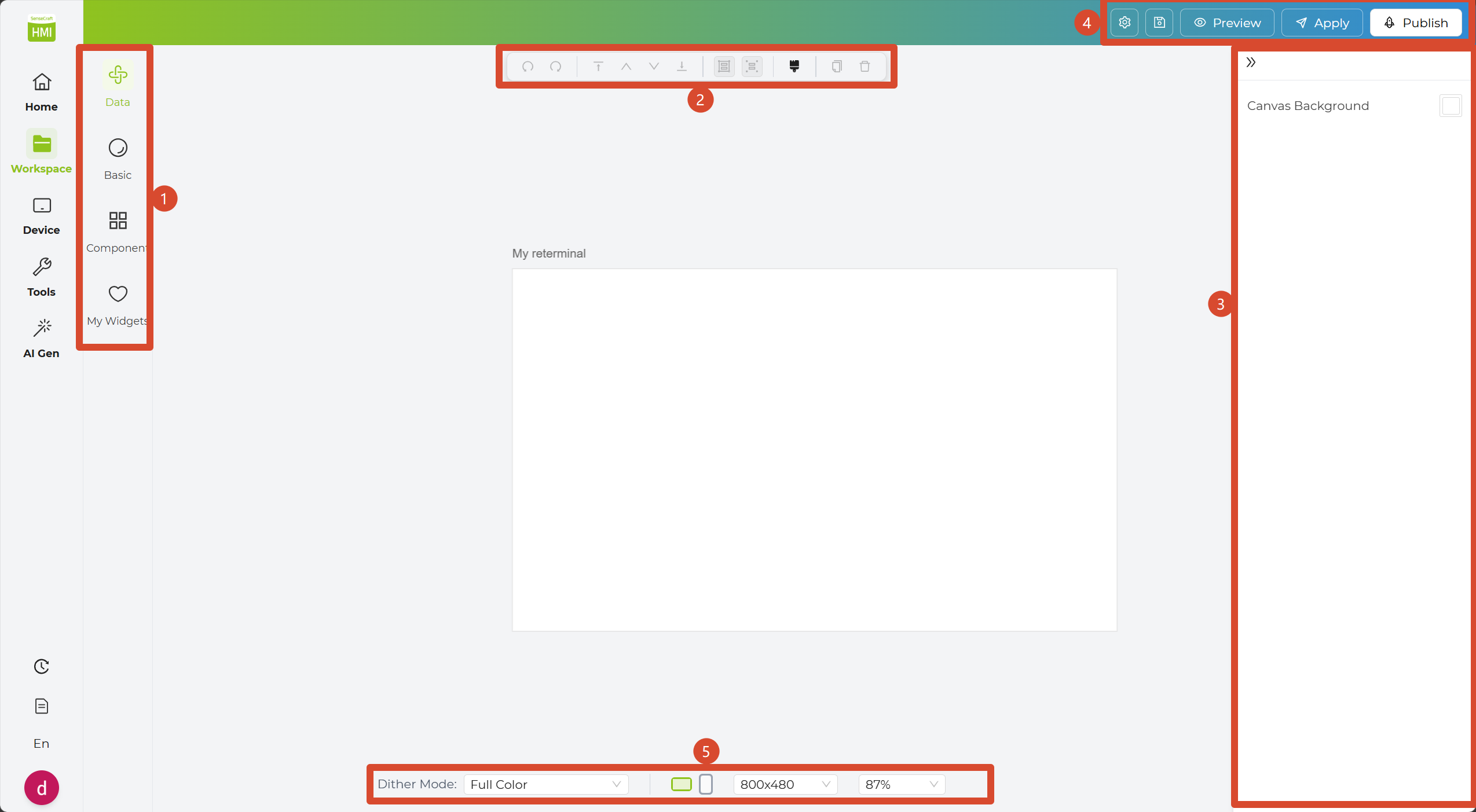
- Sidebar: On the left side, you will find four widget sections: Data Widgets, Basic Widgets, Component Widgets, and My Widgets. This is where you will spend most of your time when building a design.
- In Data Widgets, you can find ready-to-use data-driven widgets for things like weather, calendars, and sensor information.
- In Basic Widgets, you can use essential design elements such as text, images, date, simple shapes, barcodes, and QR codes.
- In Component Widgets, you can use richer widgets such as charts, dashboards, calendars, and clocks for more advanced layouts.
- In My Widgets, you can save and manage your own custom widgets so they are easier to reuse later.
-
Top Toolbar: At the top of the canvas, you will find common editing tools such as copy, rotate, delete, move layers forward or backward, Groups, and the format painter. These help you arrange content more efficiently. You can also right-click on the canvas to quickly access many of these tools.
-
Inspector Panel: When you select a widget on the canvas, the Inspector Panel appears on the right. Here, you can adjust text, style, data fields, and other settings to better fit your design.
-
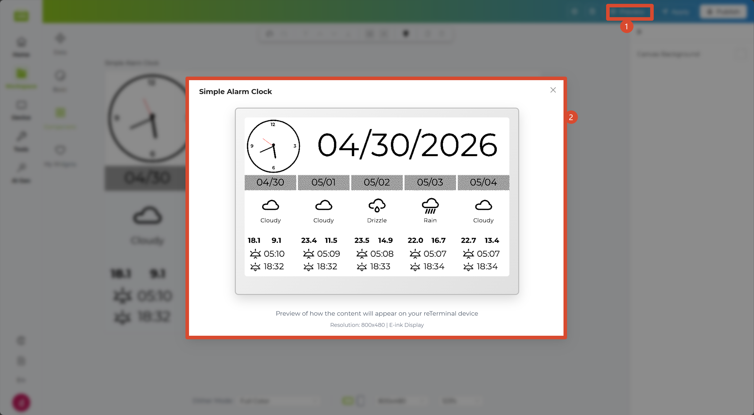
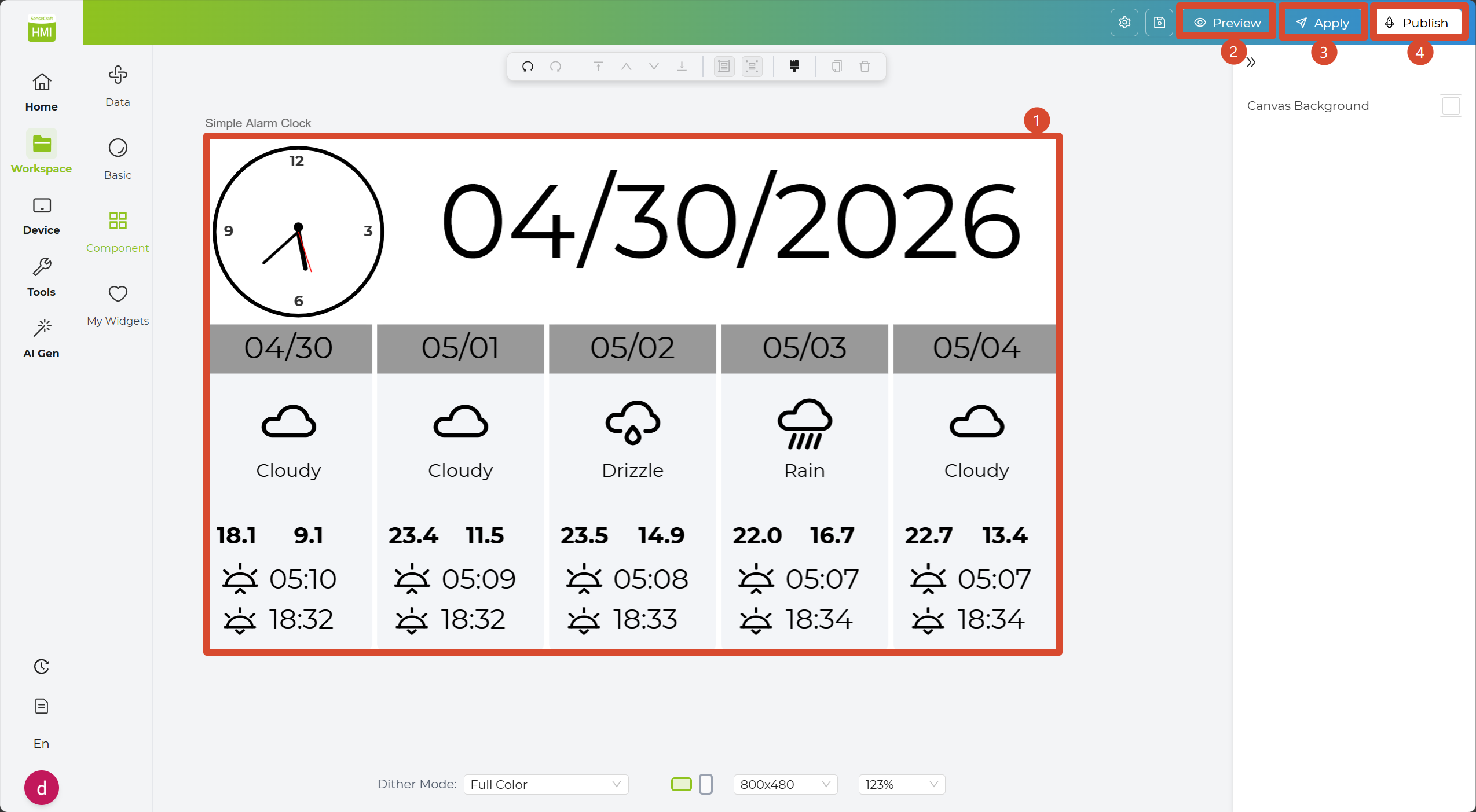
Canvas actions: In the top-right corner, you will find the main action buttons. From here, you can preview your design, apply changes, or publish it to the community.
-
Canvas settings: At the bottom of the canvas, you can adjust display-related settings such as dithering colors, portrait or landscape mode, canvas pixel size, and zoom level, making it easier to check how the design will look on your target device.
Now that you’re familiar with the Canvas Designer, let’s build your first design.
How to Build Your First Design
Section titled “How to Build Your First Design”Now that you’re familiar with the Canvas Designer layout, let’s use a simple clock design as an example and walk through the process step by step.
The following example uses the reTerminal E1002 to create a simple weather-and-clock design. You can follow the same process with your own device model.
Step 1: Create a New Design
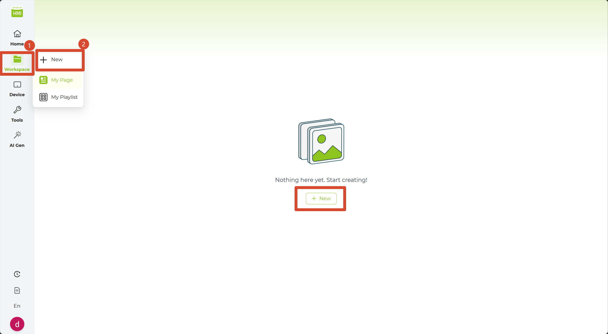
Section titled “Step 1: Create a New Design”1. Before getting started, create a new project. Click Canvas Designer in the Sidebar to open the page library, where your previous designs are listed.
2. Click the + New button in the top-left corner to create a new canvas. Alternatively, hover over the Canvas Designer item in the Sidebar to reveal the quick-add button.
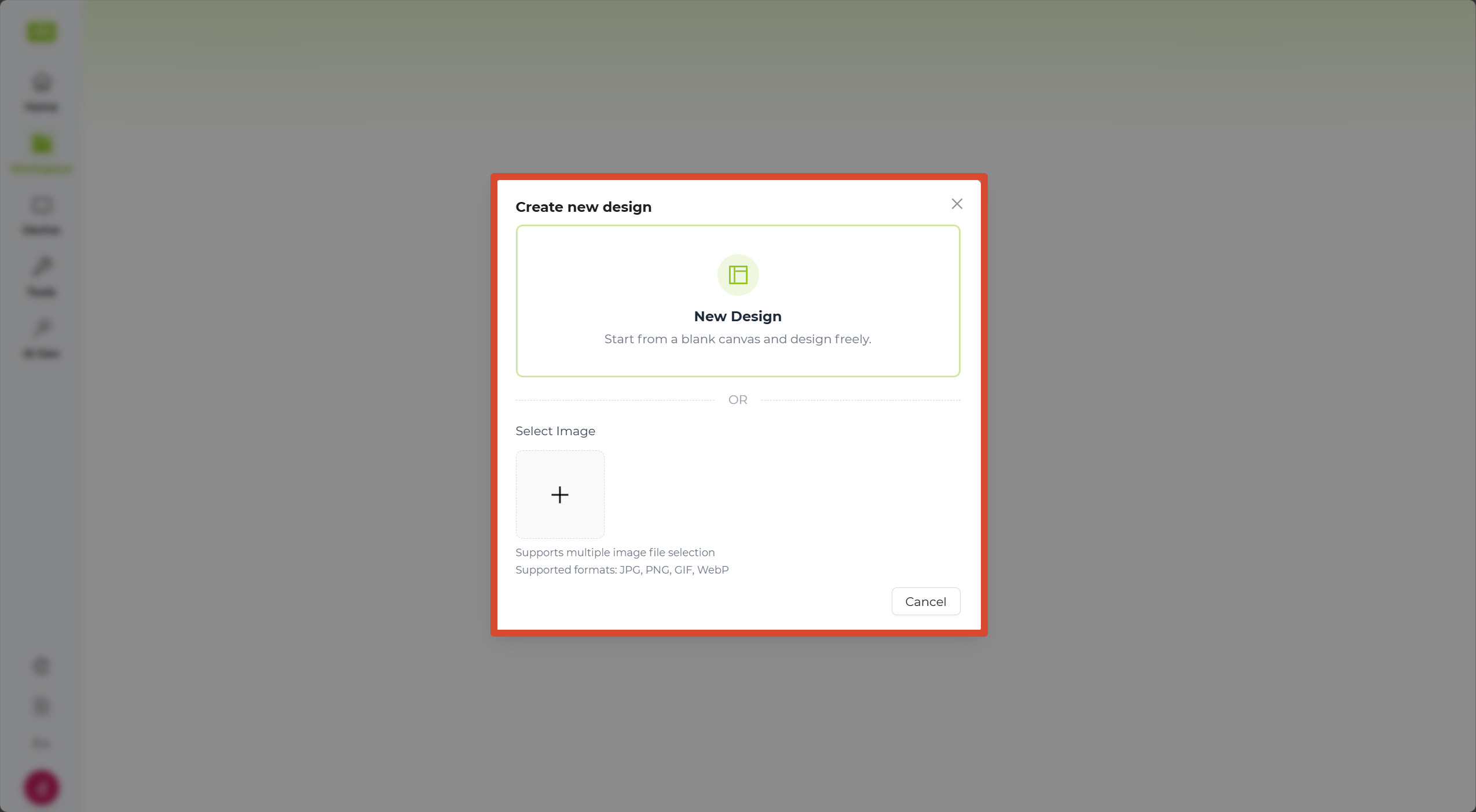
3. In the pop-up window, select New Design to start a fresh project, or use the Import Image option below to bring in an existing graphic.
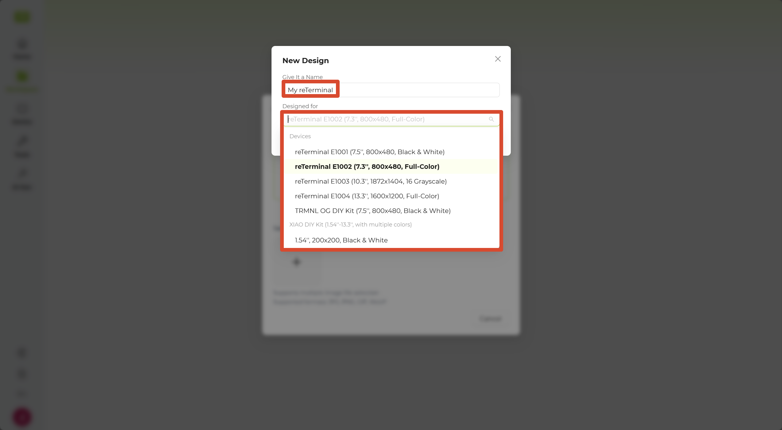
4. After selecting New Design, give your project a name, select the target device from the device list, and click Confirm. A blank canvas will appear, and you can begin designing your custom interface.
Step 2: Edit the Design
Section titled “Step 2: Edit the Design”1. In the Sidebar, open Data Widgets and select the Weather Widget.
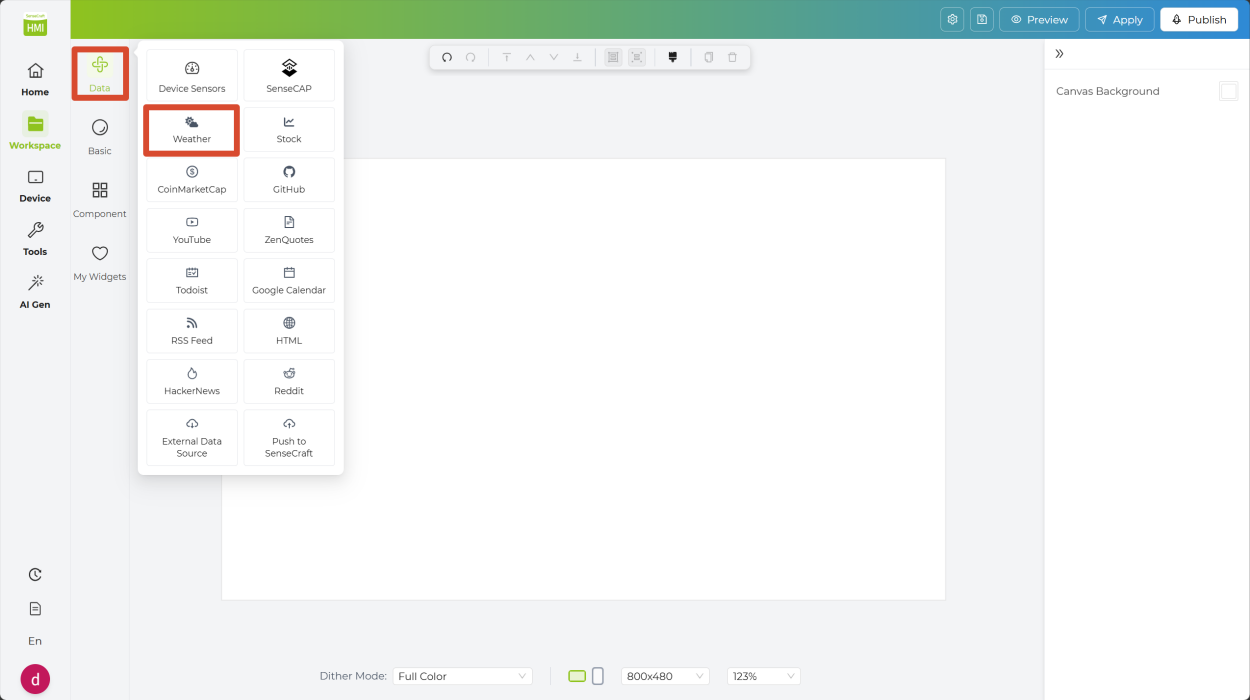
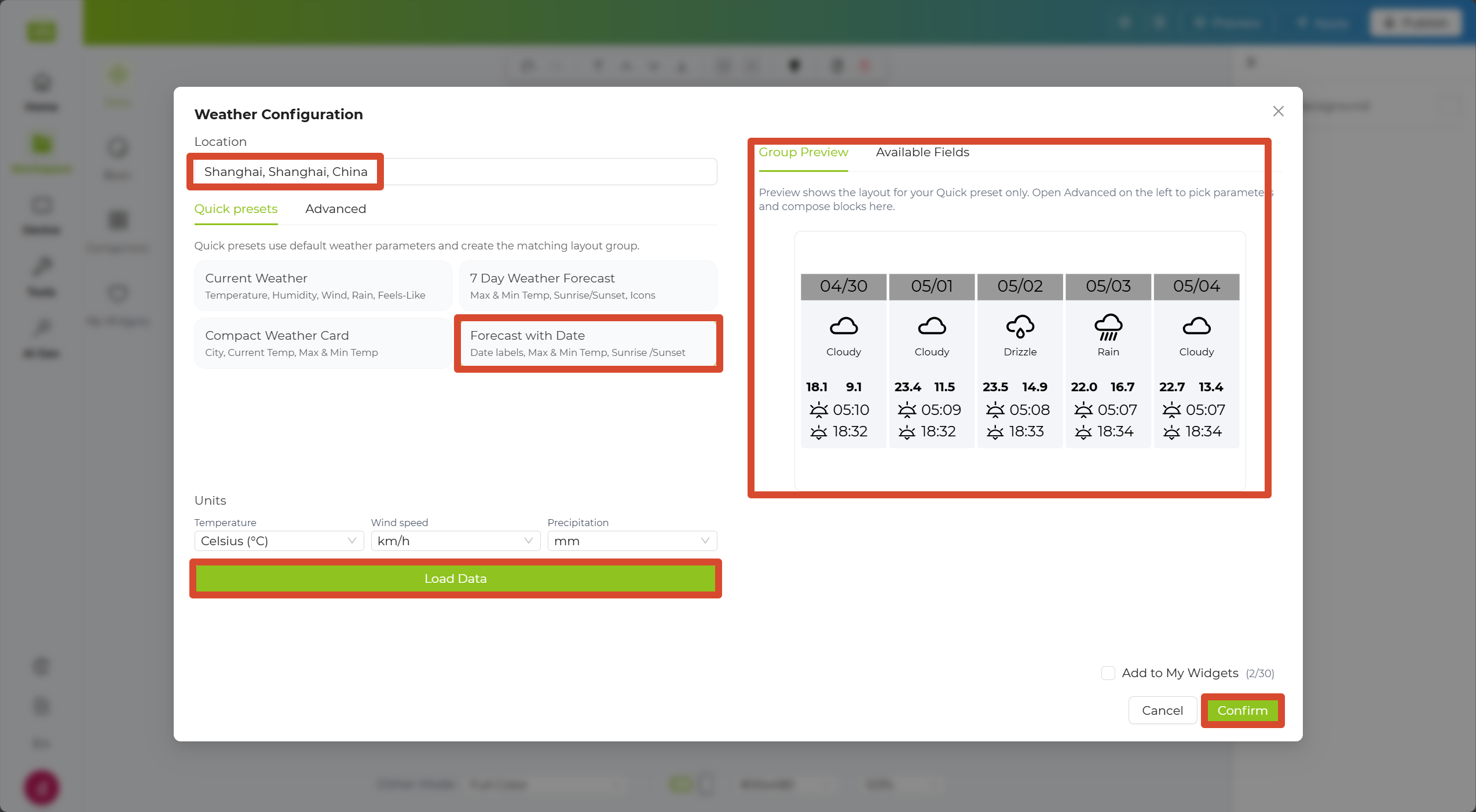
2. Enter the name of your city in the Location input field, then choose a quick layout below.
3. Click Load Data. A preview will appear on the right. Click Confirm in the bottom-right corner to place the preview on the canvas.
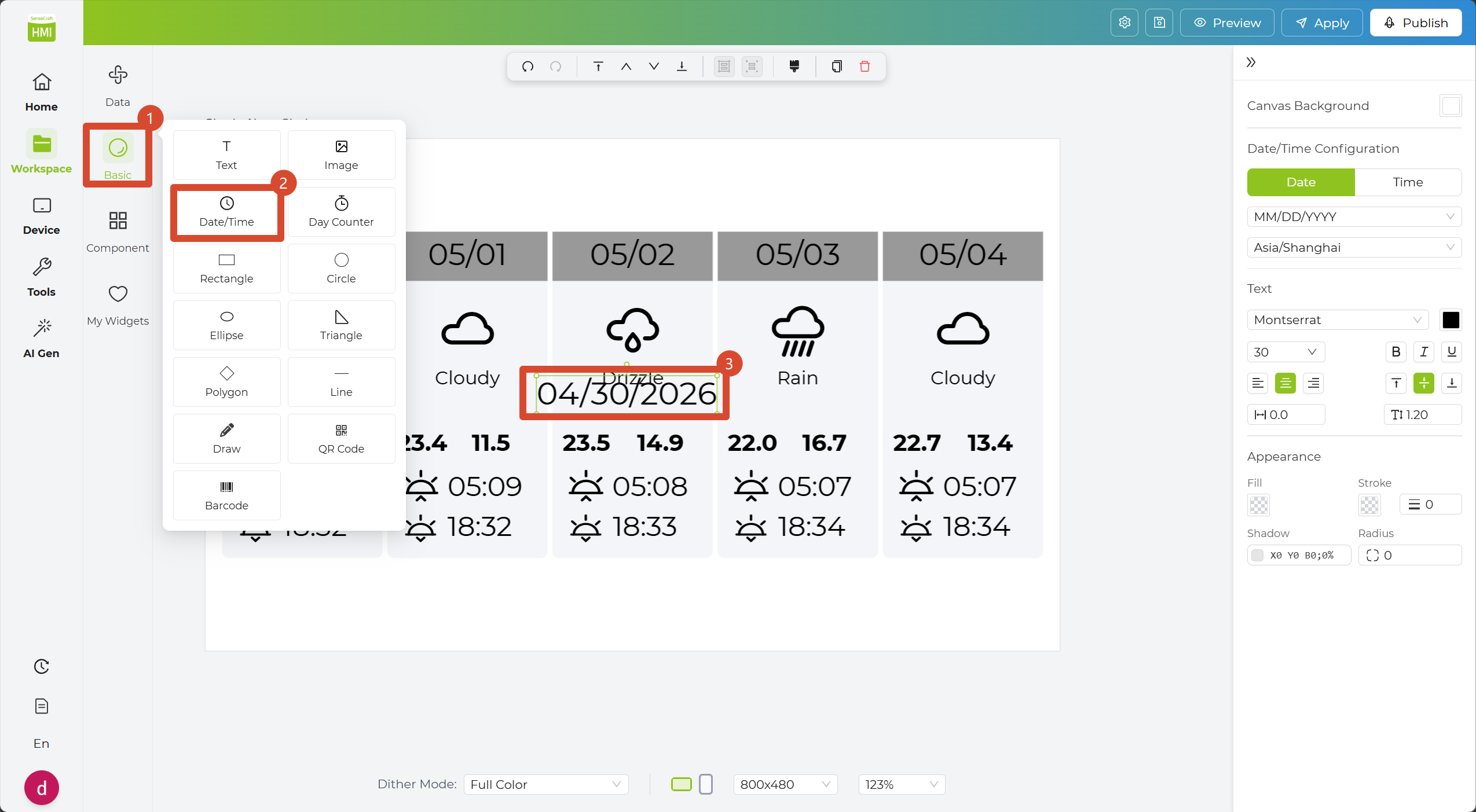
4. In the Sidebar, open Basic Widgets and select the Date/Time Widget. A date display box will automatically appear on the canvas.
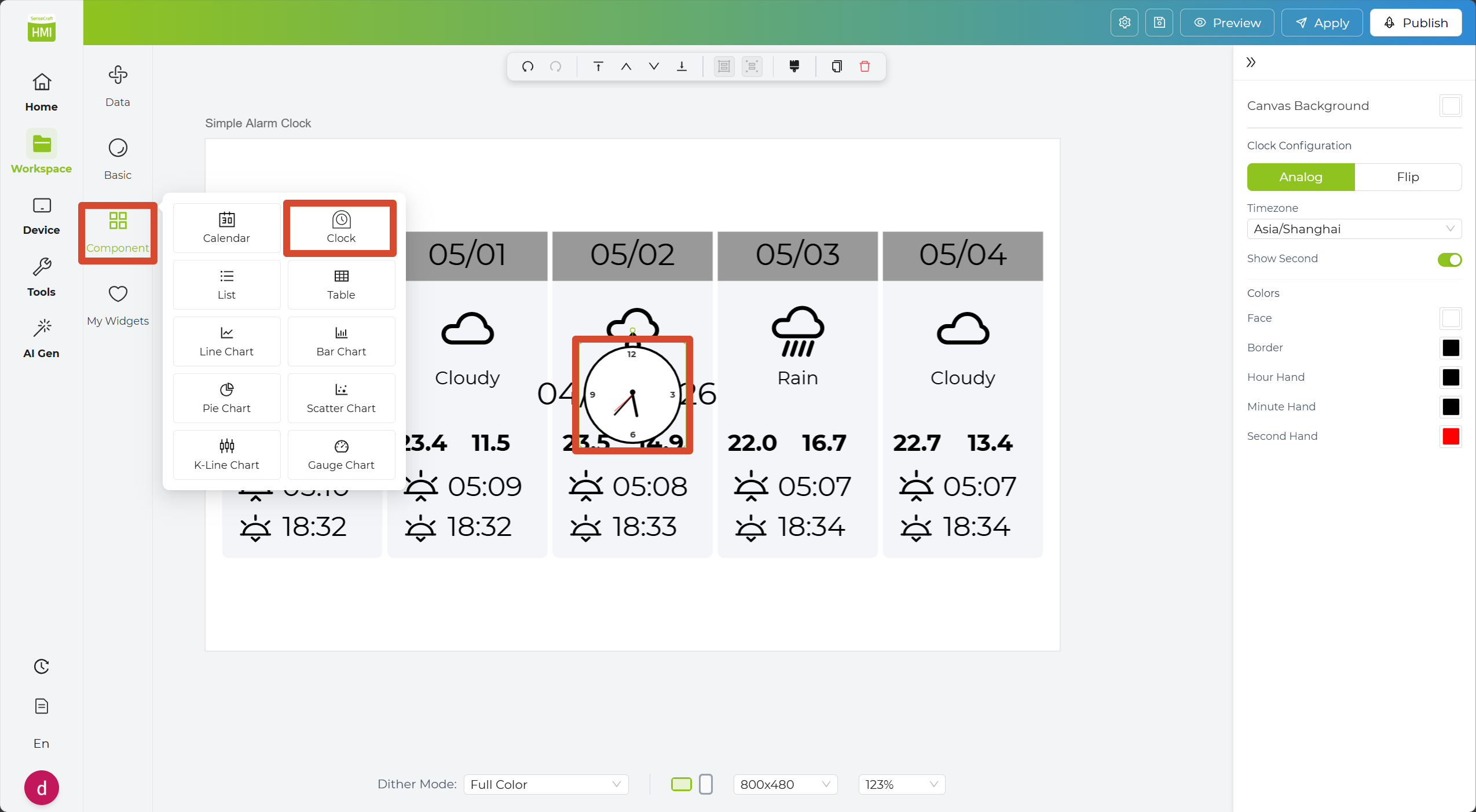
5. In the Sidebar, open Component Widgets and select the Clock Widget. A round clock will automatically appear on the canvas.
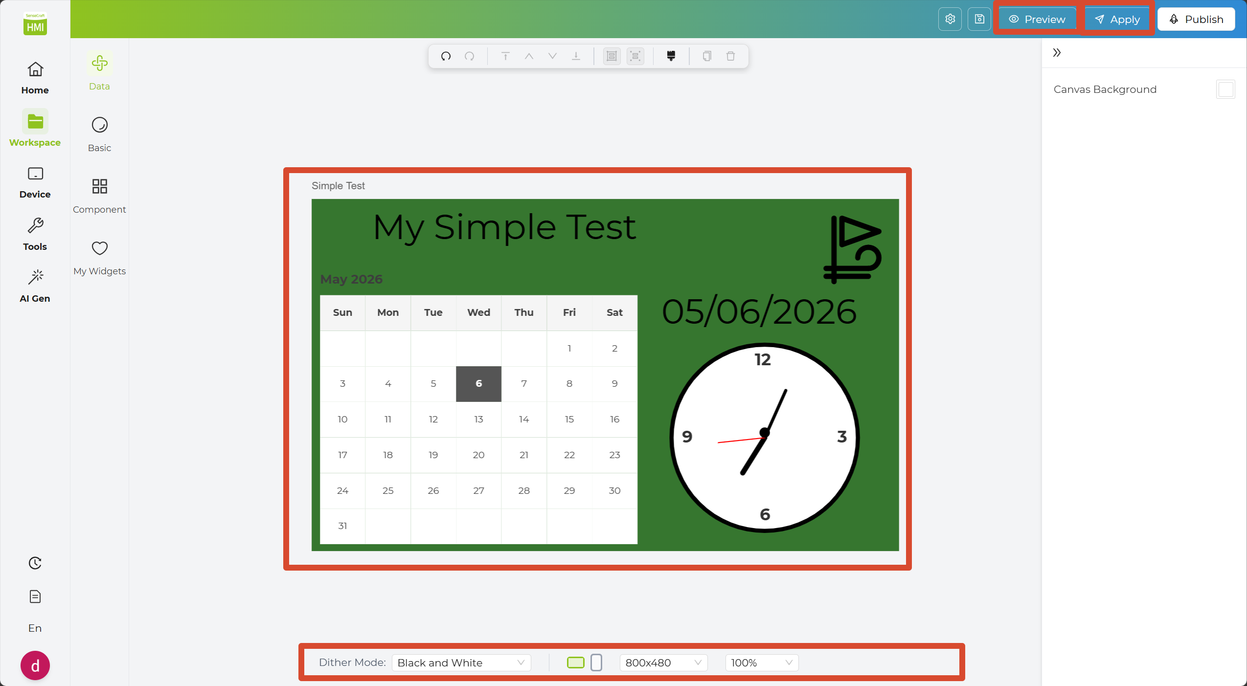
6. Adjust the layout of each widget to make the design look cleaner and more balanced. You can click Preview in the top-right corner to check the result.
7. Click Apply in the top-right corner to save the design to your project.
8. If you are happy with your design and want to share it with others, click Publish in the top-right corner to post the design to the community for other users to explore.
Now that you’ve created and applied your own design, the following sections will walk you through how each major widget category works. We’ll cover them in this order: Basic, Component, My Widgets, and Data Widgets. We’ll start with Basic Widgets, since it is the most fundamental section.
Basic Widgets
Section titled “Basic Widgets”The Basic Widgets section covers fundamental design needs, including text, images, dates, simple shapes, and even barcodes or QR codes.
| Component | What It Does |
|---|---|
| Text | Adds plain text content to the design. |
| Image | Inserts an image into the design. |
| Date/Time | Displays the current date or time. |
| Day Counter | Shows the number of days before or after a target date. |
| Rectangle | Adds a rectangular shape for layout or decoration. |
| Circle | Adds a circular shape to the design. |
| Ellipse | Adds an ellipse shape for visual decoration. |
| Triangle | Adds a triangle shape to the design. |
| Polygon | Adds a polygon shape with multiple sides. |
| Line | Adds a straight line for separation or decoration. |
| Draw | Lets you draw custom freeform graphics manually. |
| QRCode | Generates a QR code from text or a link. |
| Barcode | Generates a barcode for encoded data. |
Next, follow the steps below to use widgets from Basic Widgets to create a simple clock design.
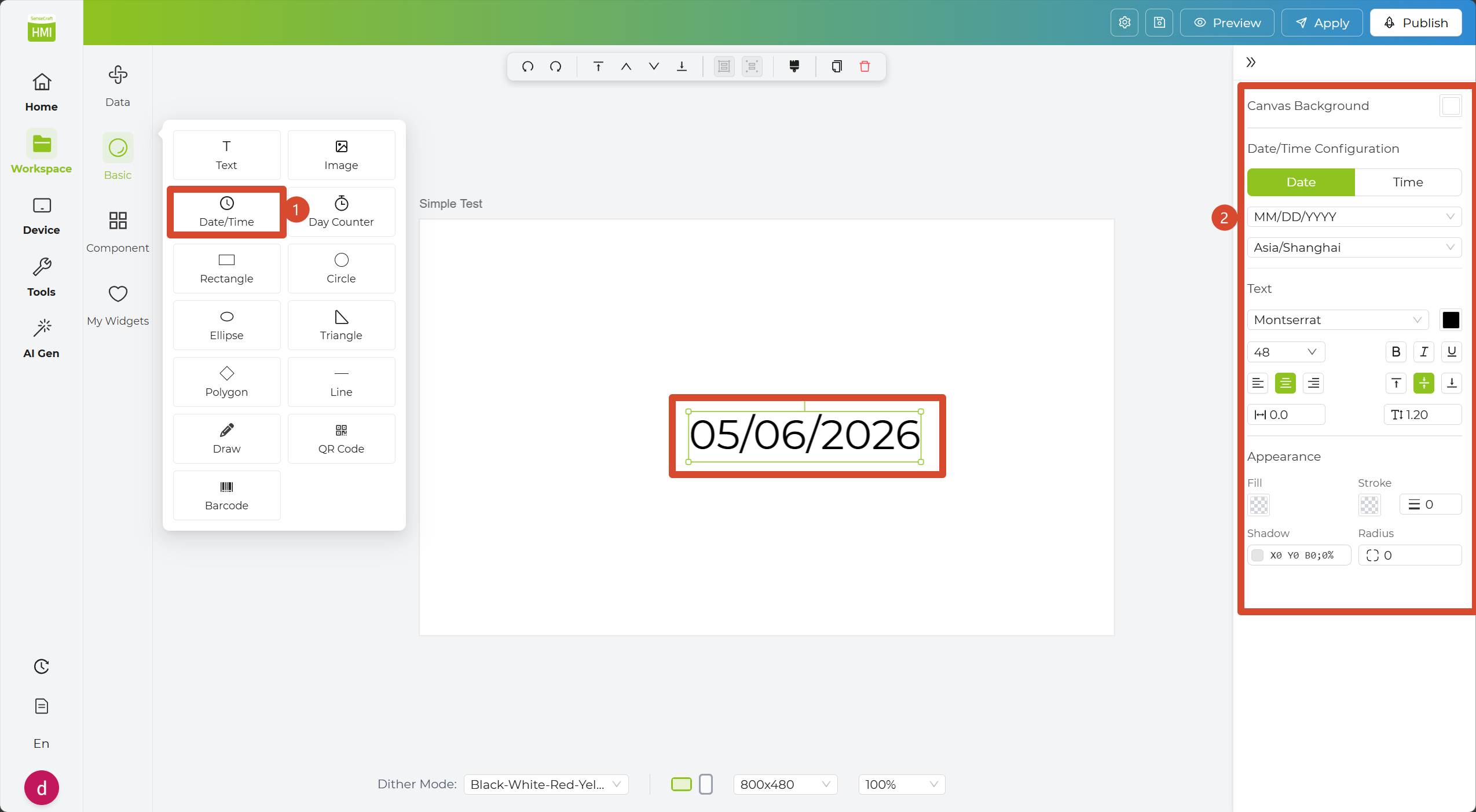
Step 1. In Basic Widgets, click the Date/Time Widget; it will automatically appear on the canvas.
Step 2. Click the widget and configure it in the Inspector Panel, where you can adjust the date/time format, font size, color, and more.
Step 3. Modify the format in the property bar, such as changing it to YYYY-MM-DD HH:mm:ss.
Step 4. Deselect the widget or click the canvas to see the date/time updated to your chosen format.
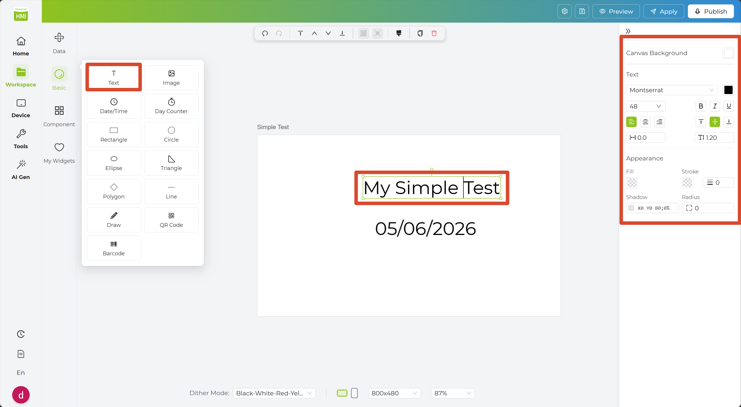
Step 5. Select the Text Widget and enter the text you want to display. In the Inspector Panel, you can adjust settings such as the font size and text color.
Step 6. Select the Rectangle Widget to use it as a background shape. You can adjust its size and color in the Inspector Panel.
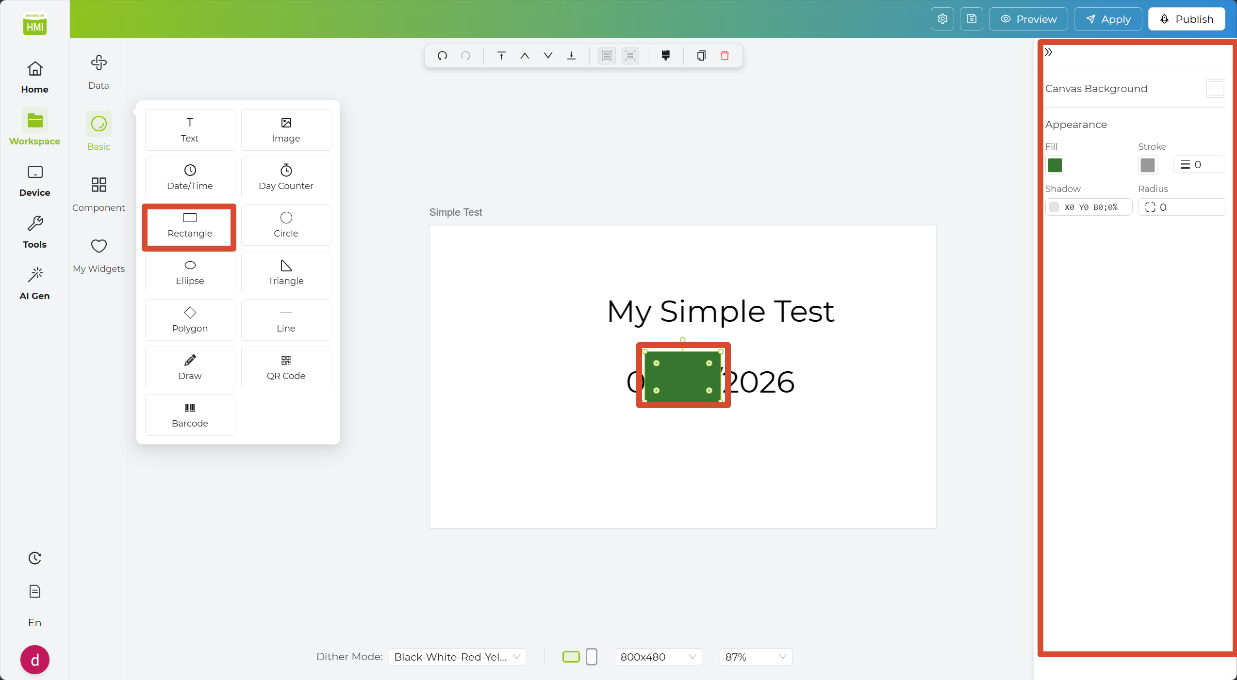
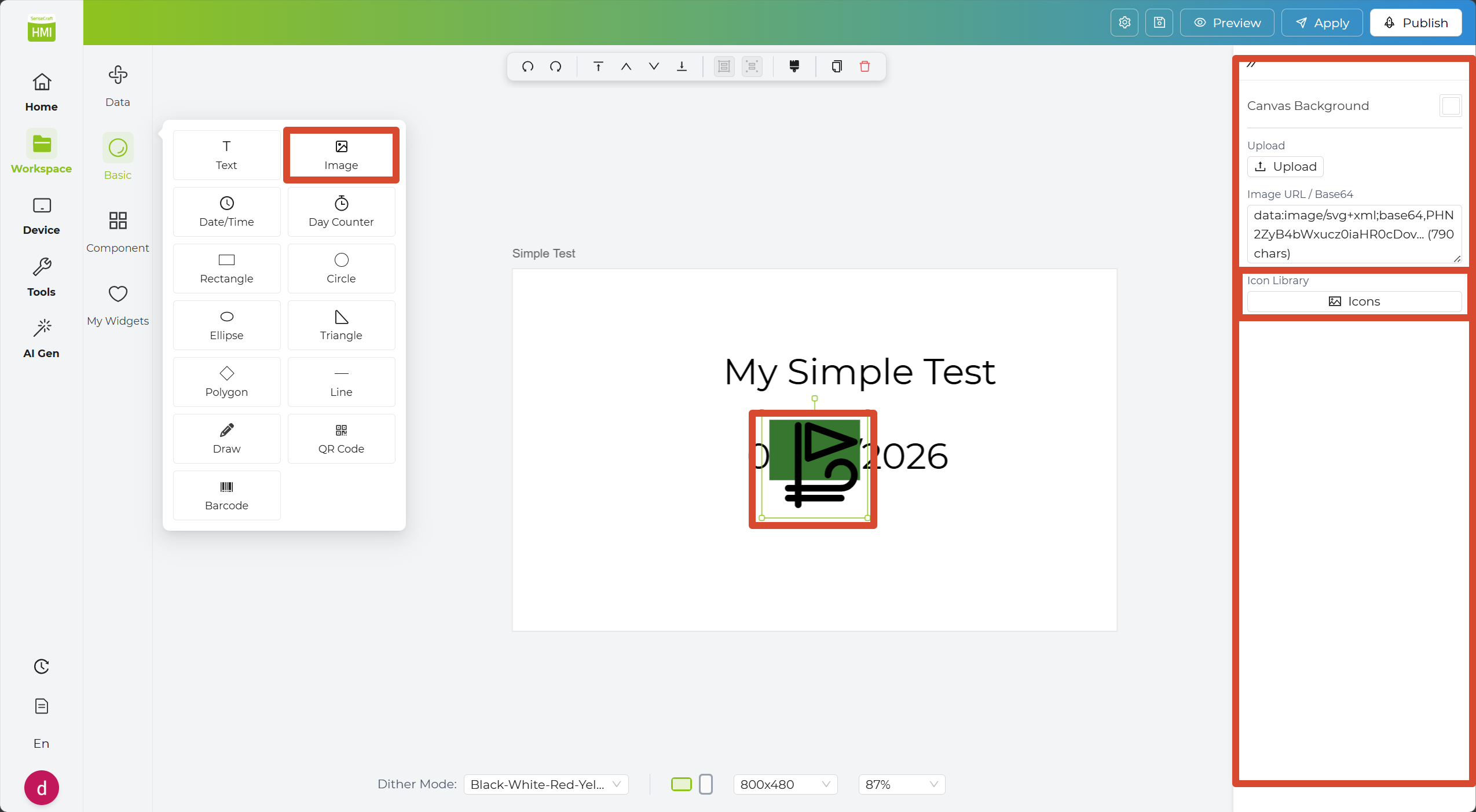
Step 7. Select the Image Widget. In the Inspector Panel, you can enter an image URL or Base64 content. If you do not already have an image to use, you can also browse the Icon Library in the Inspector Panel to find a suitable icon.
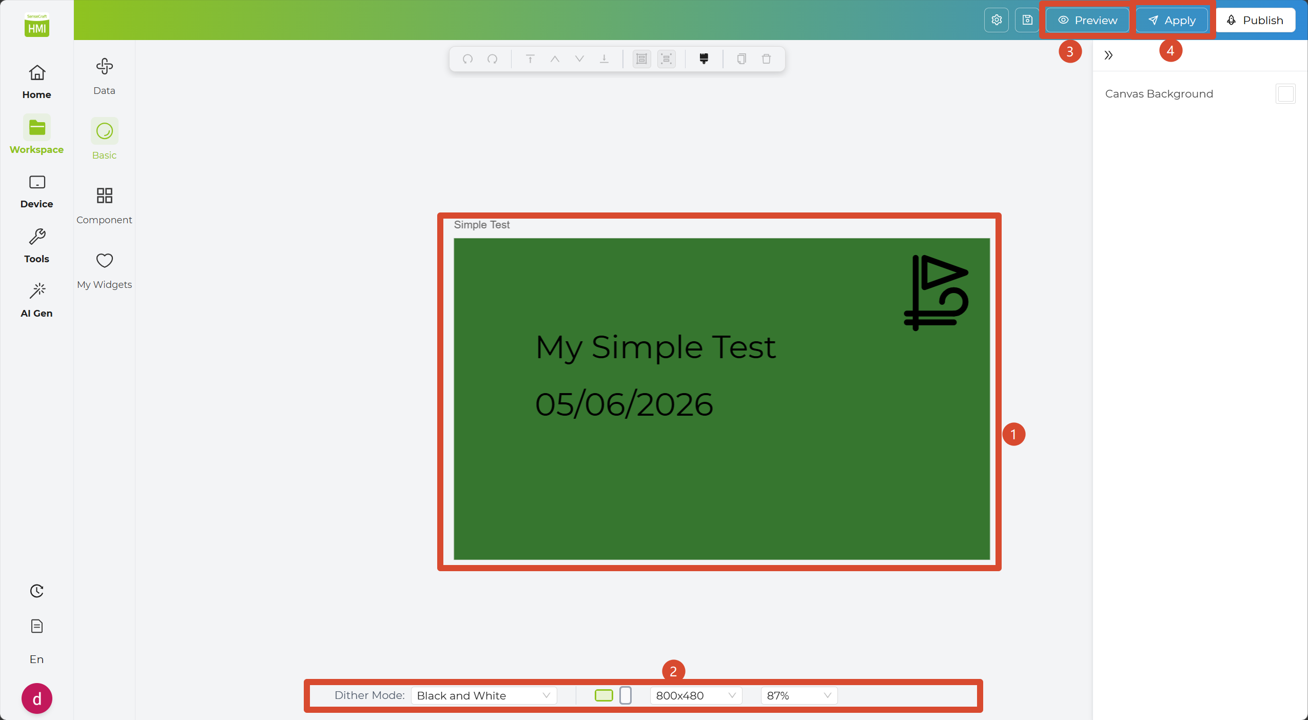
Step 8. Adjust the position of each widget to improve the overall layout. You can also use the canvas settings at the bottom to further refine the appearance of the design.
Step 9. Click Preview to check how the design will look on the canvas. When you are satisfied with the result, click Apply to send it to your device.
Component Widgets
Section titled “Component Widgets”The Component Widgets section includes more advanced elements such as charts, dashboards, calendars, and clocks.
| Component | What It Does |
|---|---|
| Calendar | Displays a calendar view for a selected date. |
| Clock | Displays an analog clock in the design. |
| List | Shows multiple items in a list layout. |
| Table | Displays structured data in rows and columns. |
| Line Chart | Displays trends over time or across connected data points. |
| Bar Chart | Visualizes values with bars for easy comparison. |
| Pie Chart | Shows proportions as slices of a circle. |
| Scatter Chart | Shows the distribution of data points across two axes. |
| K-Line Chart | Displays open, high, low, and close values over time. |
| Gauge Chart | Displays a value within a gauge-style range. |
Next, continue from the Basic Widgets example above and use Component Widgets to further improve the clock design.
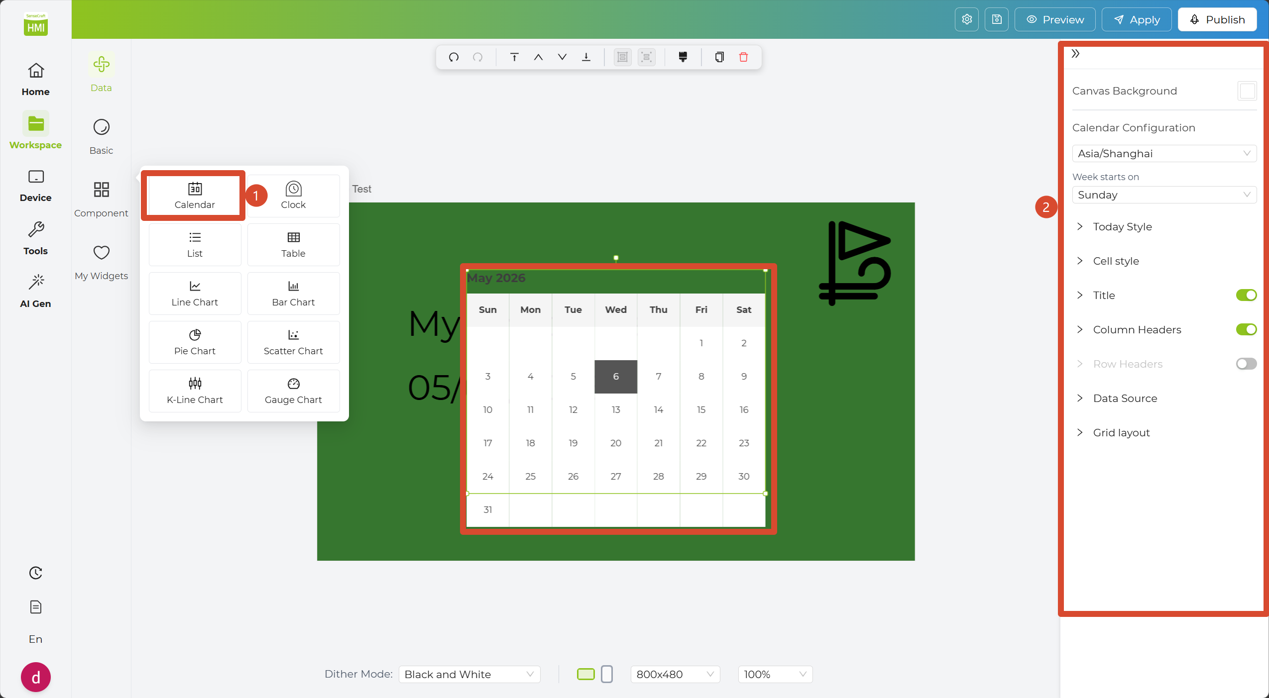
Step 1. In Component Widgets, click the Calendar Widget to add it to the canvas.
Step 2. Click the widget to configure it in the Inspector Panel, such as the displayed date and color scheme.
Step 3. Click the canvas to see the calendar update with your selected settings.
Step 4. Add a Clock Widget to the canvas. Then use the Inspector Panel to adjust its settings, such as style, size, and color.
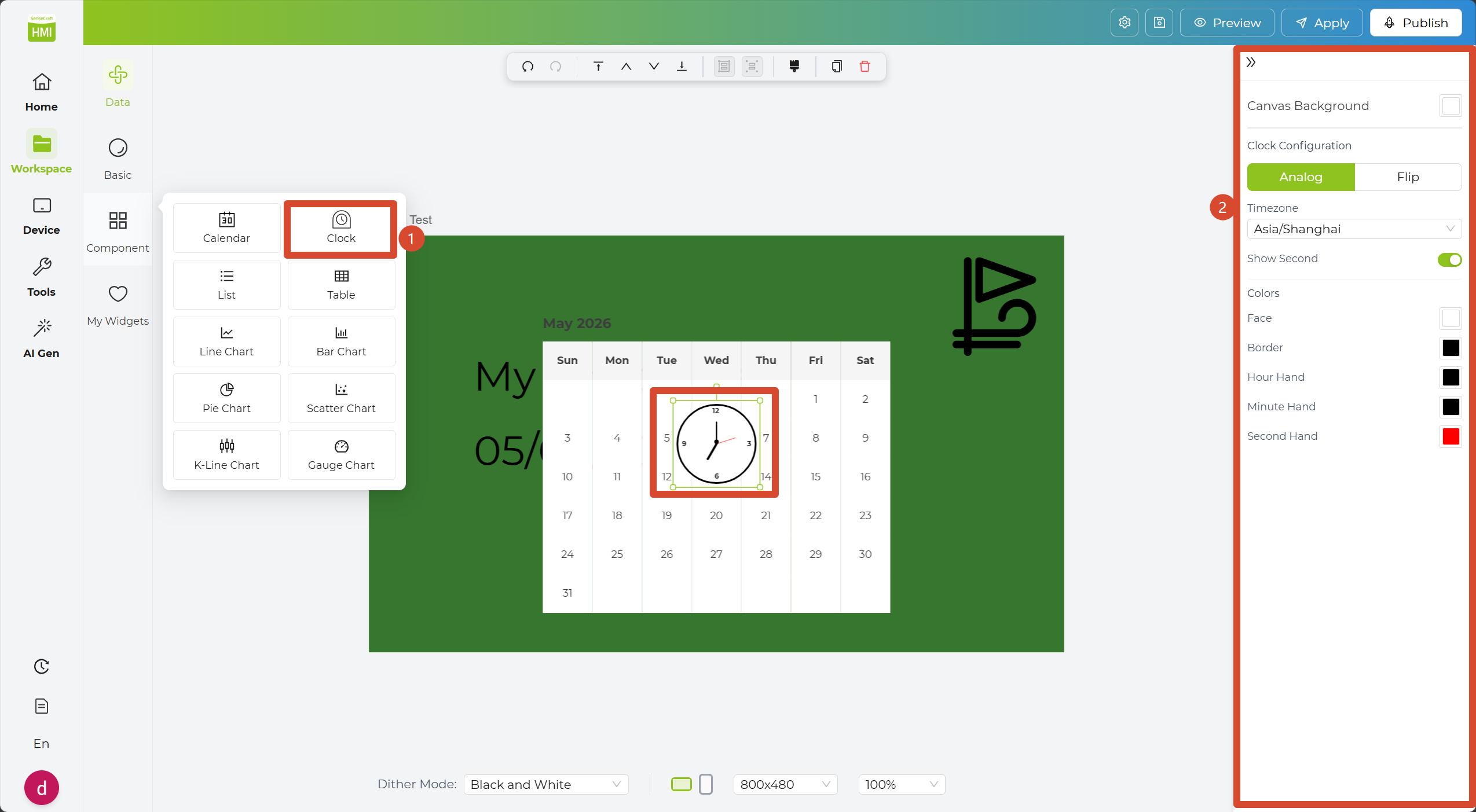
Step 5. Reposition the added widgets to create a cleaner layout. You can also use the canvas settings at the bottom to further refine the overall appearance.
Step 6. Click Preview to check how the page will look. When you are satisfied with the result, click Apply to send the page to your device.
My Widgets
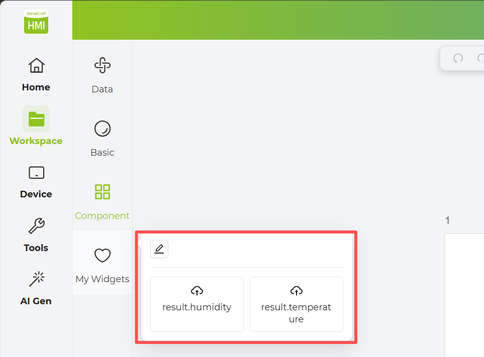
Section titled “My Widgets”The My Widgets section is for your custom widgets. If you use a specific data source frequently, you can click the Add to My Widgets button in the bottom-right corner. This saves the data widget to your personal widget library, allowing you to drag and drop it directly next time without reconfiguring the API.
Data Widgets
Section titled “Data Widgets”The Data Widgets section lets you connect external data and display it in your design. Whether you use built-in data connectors or custom data sources, you can build dynamic visual dashboards.
Device Sensors Widget
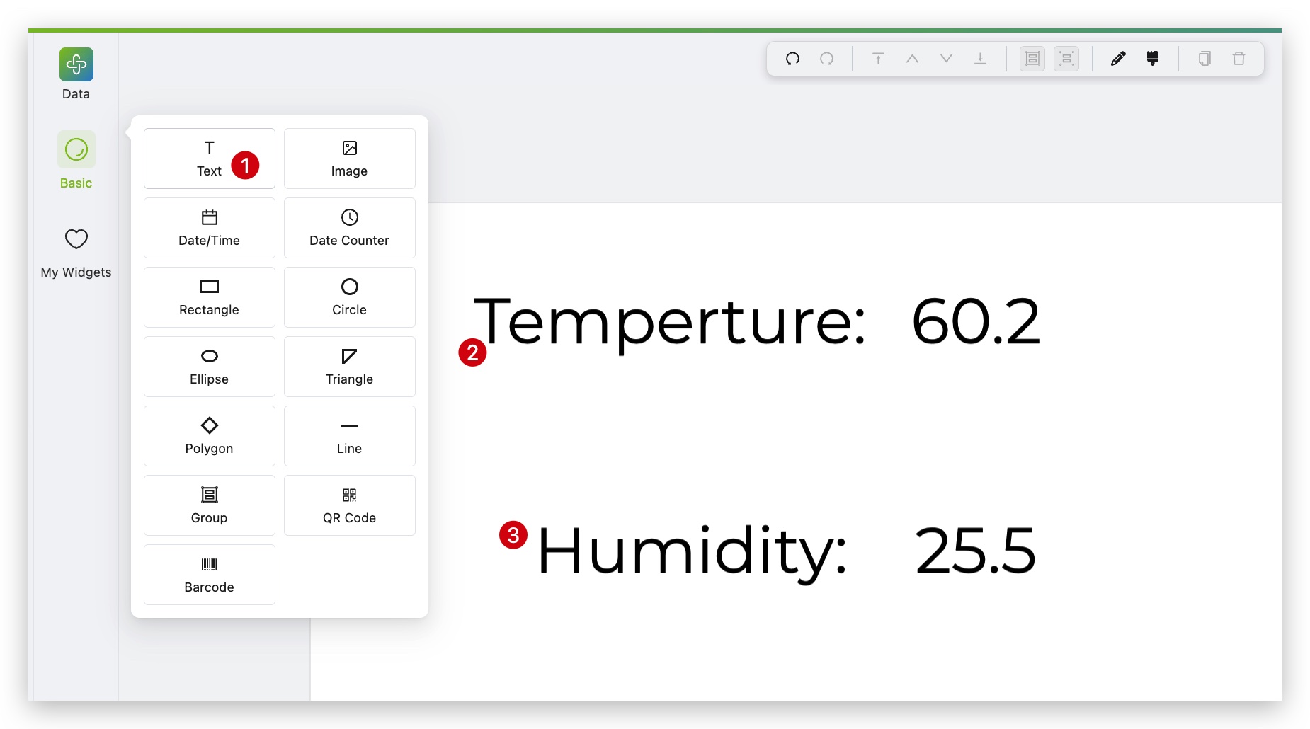
Section titled “Device Sensors Widget”The Device Sensors Widget allows you to read data from device sensors and display it directly on your screen.
Step 1. Select the device you want to monitor and click the Load Sensor Data button. The Available Field will appear on the right.
Step 2. Click the specific sensor data or text content you wish to display.
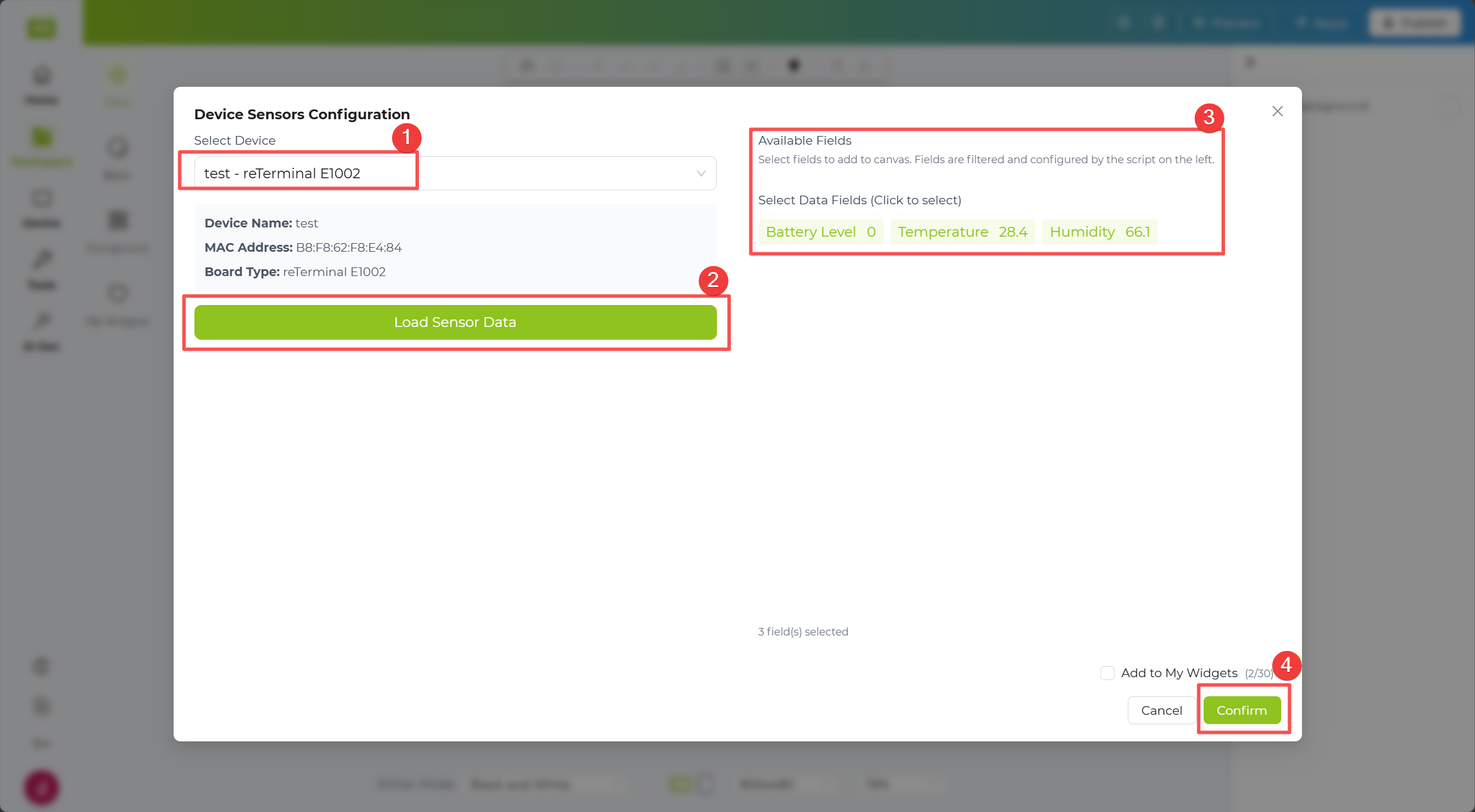
Step 3. In the tree structure, check the data fields you want to display. The selected data will automatically appear on the canvas to the right.
Step 4. Click the Apply button in the top-right corner of the canvas to push the data to the device.
SenseCAP Widget
Section titled “SenseCAP Widget”The SenseCAP Widget lets you connect your SenseCAP account and read real-time data from the linked sensors.
Step 1. Enter your SenseCAP Access ID in the corresponding input field.
Step 2. Enter your SenseCAP Access Key in the corresponding input field.
Step 3. In the Devices list, select the device you want to monitor. The corresponding sensor data will appear on the right.
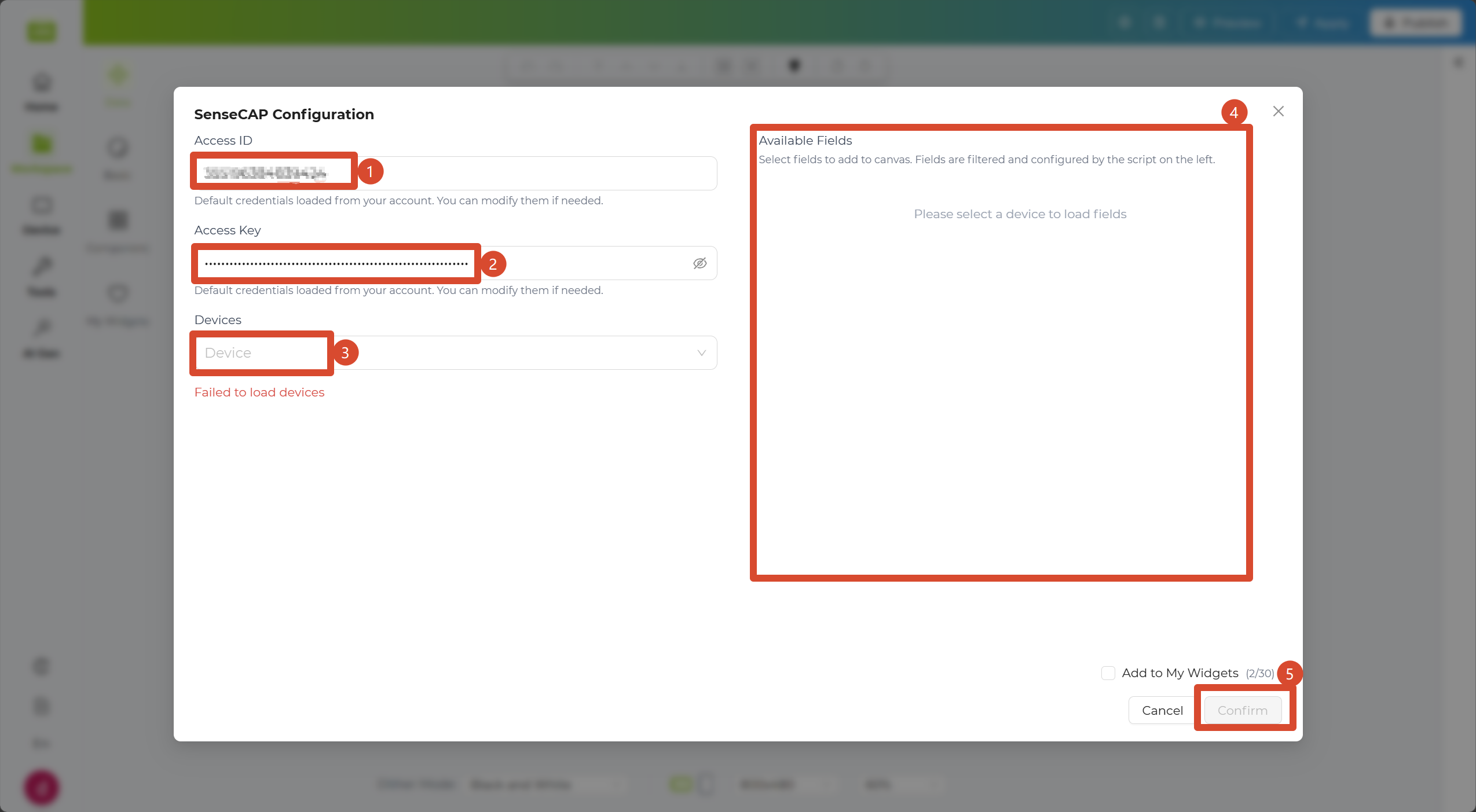
Step 4. Click the Apply button in the top-right corner of the canvas to push the data to the device.
Weather Widget
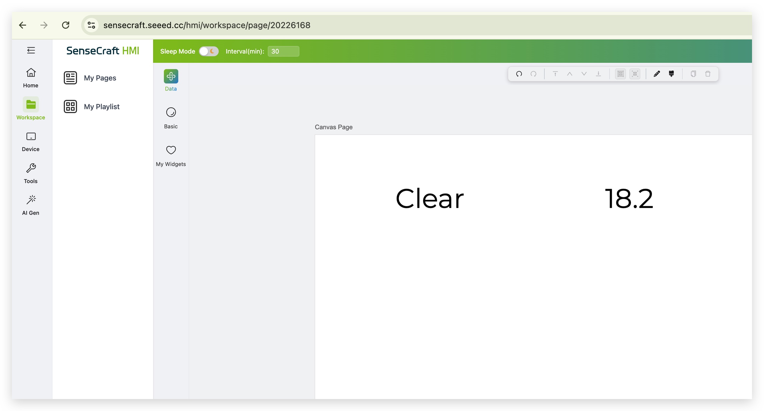
Section titled “Weather Widget”The Weather Widget allows you to create live weather displays for a selected city. You can quickly generate a ready-made layout with preset fields, or fine-tune the displayed data and units for a more customized result.
Step 1. Enter the city name you want to query in the first field.
Step 2. Use Quick presets to select a default weather layout and field combination. In the Units section, choose the measurement units you want to display. If needed, switch to Advanced for more detailed customization.
Step 3. Click Load Data to generate a preview on the right. After confirming the result, click Confirm to place the weather layout on the canvas.
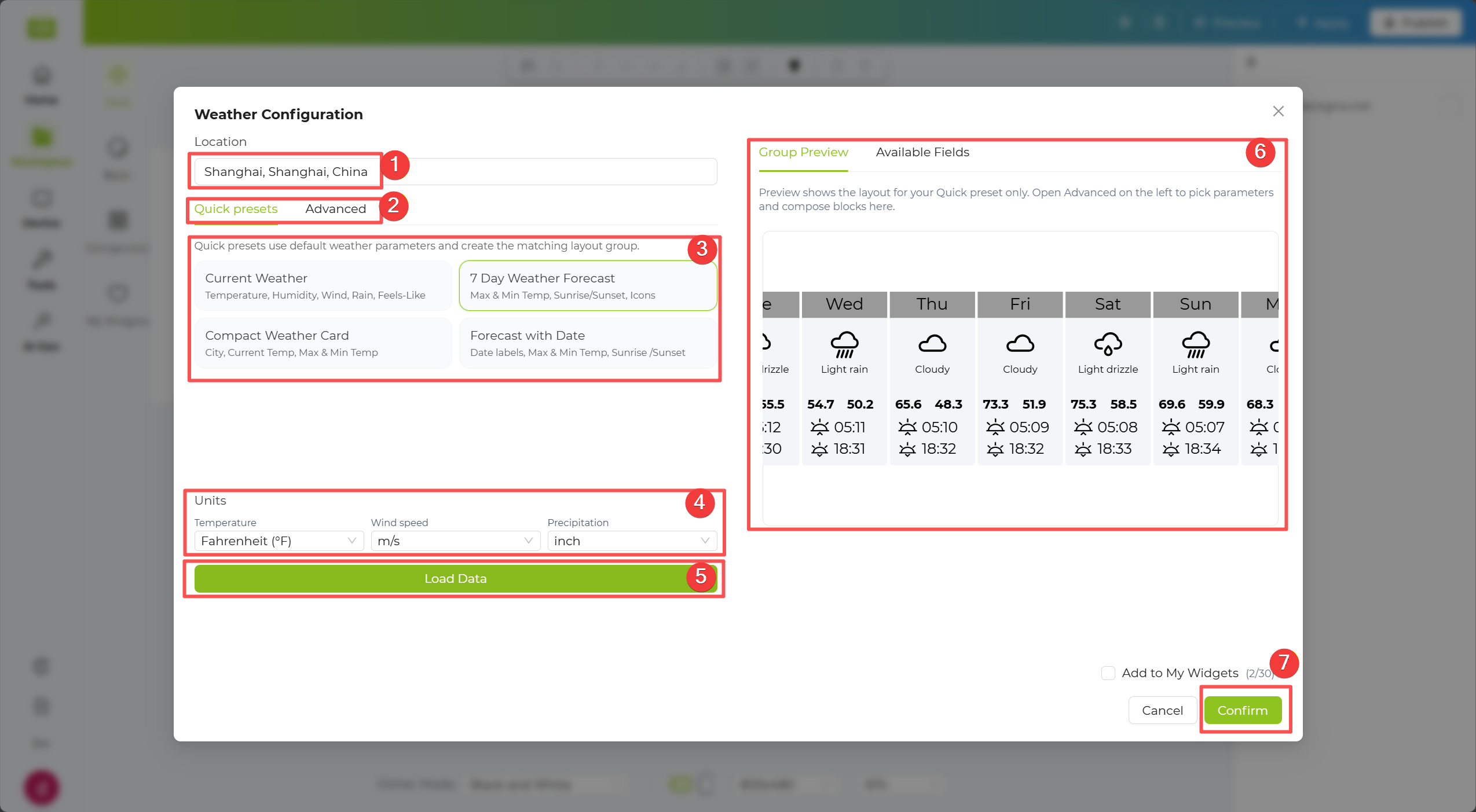
Step 4. Click the Apply button in the top-right corner of the canvas to push the data to the device.
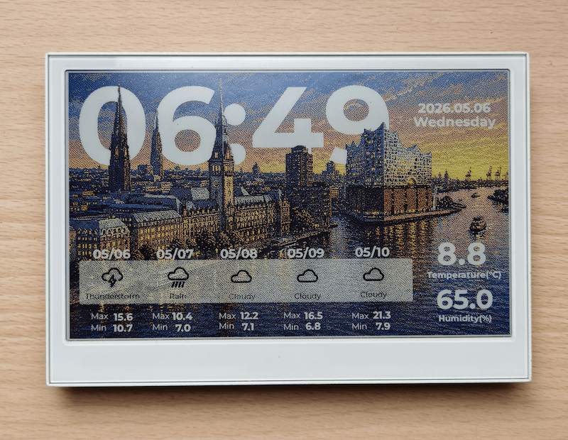
Community Templates
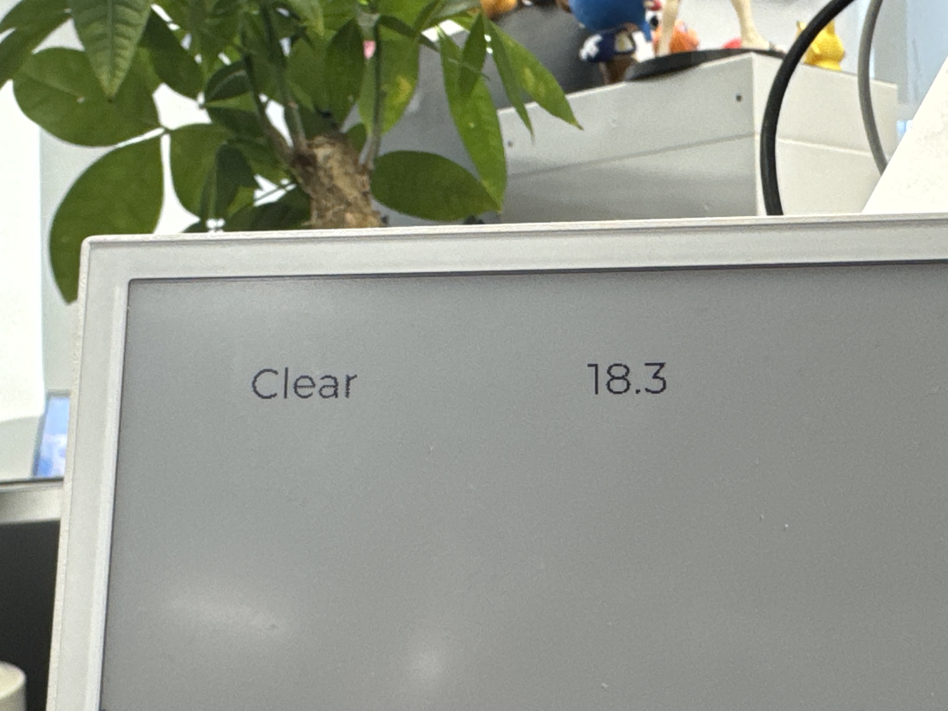
Section titled “Community Templates”After simple layout and style adjustments, your result can look like this community template:
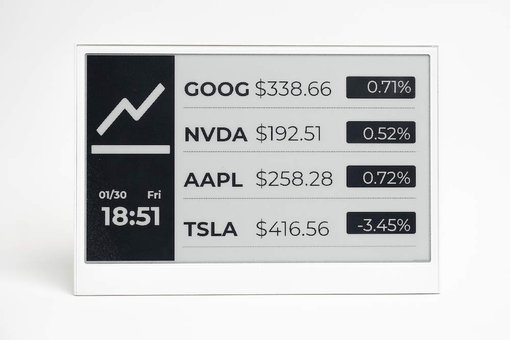
Stock Widget
Section titled “Stock Widget”The Stock Widget lets you display real-time stock information in your design. You can look up a stock by symbol and choose whether to show the current price or a K-line chart.
Step 1. Enter your Stock API key in the first field. If you do not already have one, use the link provided in the interface to view the API key instructions.
Step 2. In the Stock Symbol field, enter the stock symbol you want to track. Then choose the display type in the Display section, such as Current Price or K-line Chart.
Step 3. Click Search to generate a preview on the right. After reviewing the result, click Confirm to add the stock layout to the canvas.
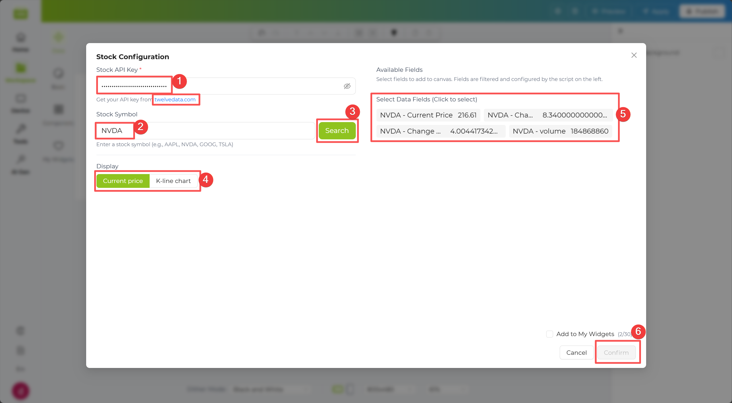
Step 4. Click the Apply button in the top-right corner of the canvas to push the data to the device.
Community Templates
Section titled “Community Templates”After simple layout and style adjustments, your result can look like this community template:
CoinMarketCap Widget
Section titled “CoinMarketCap Widget”The CoinMarketCap Widget lets you display cryptocurrency market data in your design. By entering a crypto symbol, you can quickly generate a live data widget for the asset you want to follow.
Step 1. Enter your CoinMarketCap API key in the first field. If you do not already have one, use the link provided in the interface to check how to obtain it.
Step 2. In the Cryptocurrency Symbol field, enter the crypto symbol you want to monitor.
Step 3. Click Search to generate a preview on the right. After reviewing the result, click Confirm to place the cryptocurrency layout on the canvas.
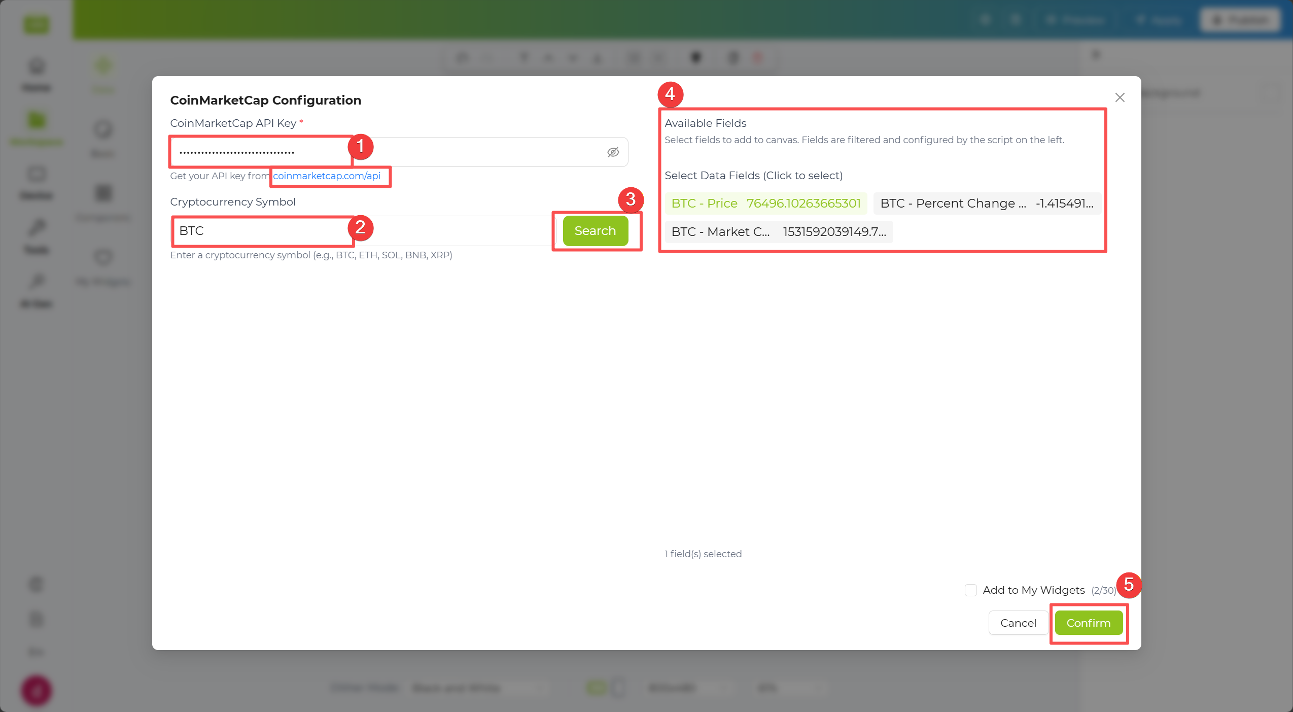
Step 4. Click the Apply button in the top-right corner of the canvas to push the data to the device.
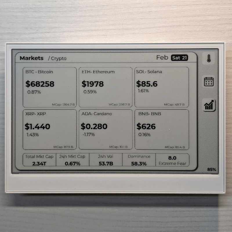
Community Templates
Section titled “Community Templates”After simple layout and style adjustments, your result can look like this community template:
GitHub Widget
Section titled “GitHub Widget”The GitHub Widget lets you display user or repository information directly in your layout, such as profile stats, repo metadata, and activity-related fields.
Step 1. Enter your GitHub API key in the first field. If you do not already have one, use the link provided in the interface to check how to obtain it.
Step 2. In the GitHub User field, enter the GitHub username you want to monitor.
Step 3. Select User Info to display profile-related data. After entering the username, Available Field will appear on the right for quick selection.
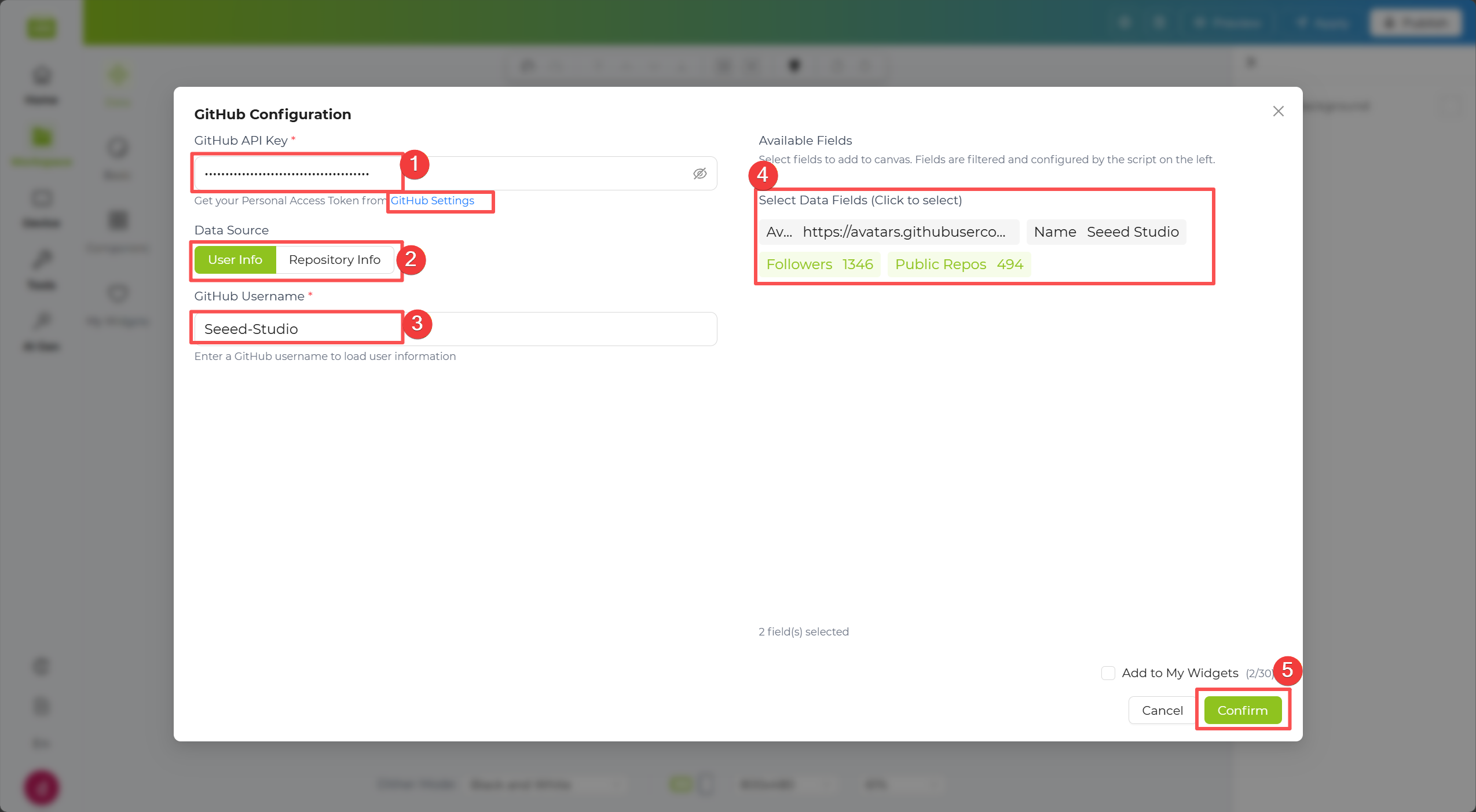
Step 4. You can also select Repository Info. Enter a repository name, click Search, then choose a repository from the results. Available repository fields will appear on the right.
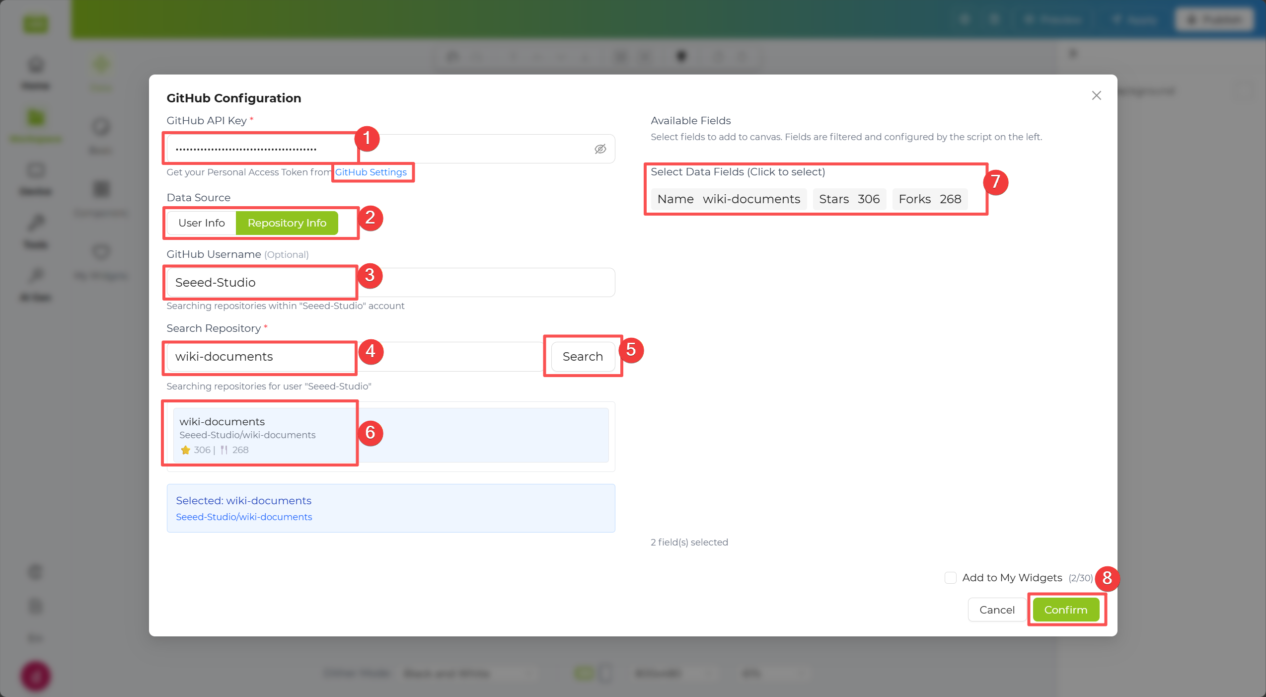
Step 5. Click the Apply button in the top-right corner of the canvas to push the data to the device.
YouTube Widget
Section titled “YouTube Widget”The YouTube Widget lets you display channel-level data such as channel name, subscriber metrics, and other supported public fields.
Step 1. Enter your YouTube API key in the first field. If you do not already have one, use the link provided in the interface to check how to obtain it.
Step 2. Enter a Channel ID or Handle in the input field below.
Step 3. Click Search to load channel data. After reviewing the preview on the right, click Confirm to place the channel information layout on the canvas.
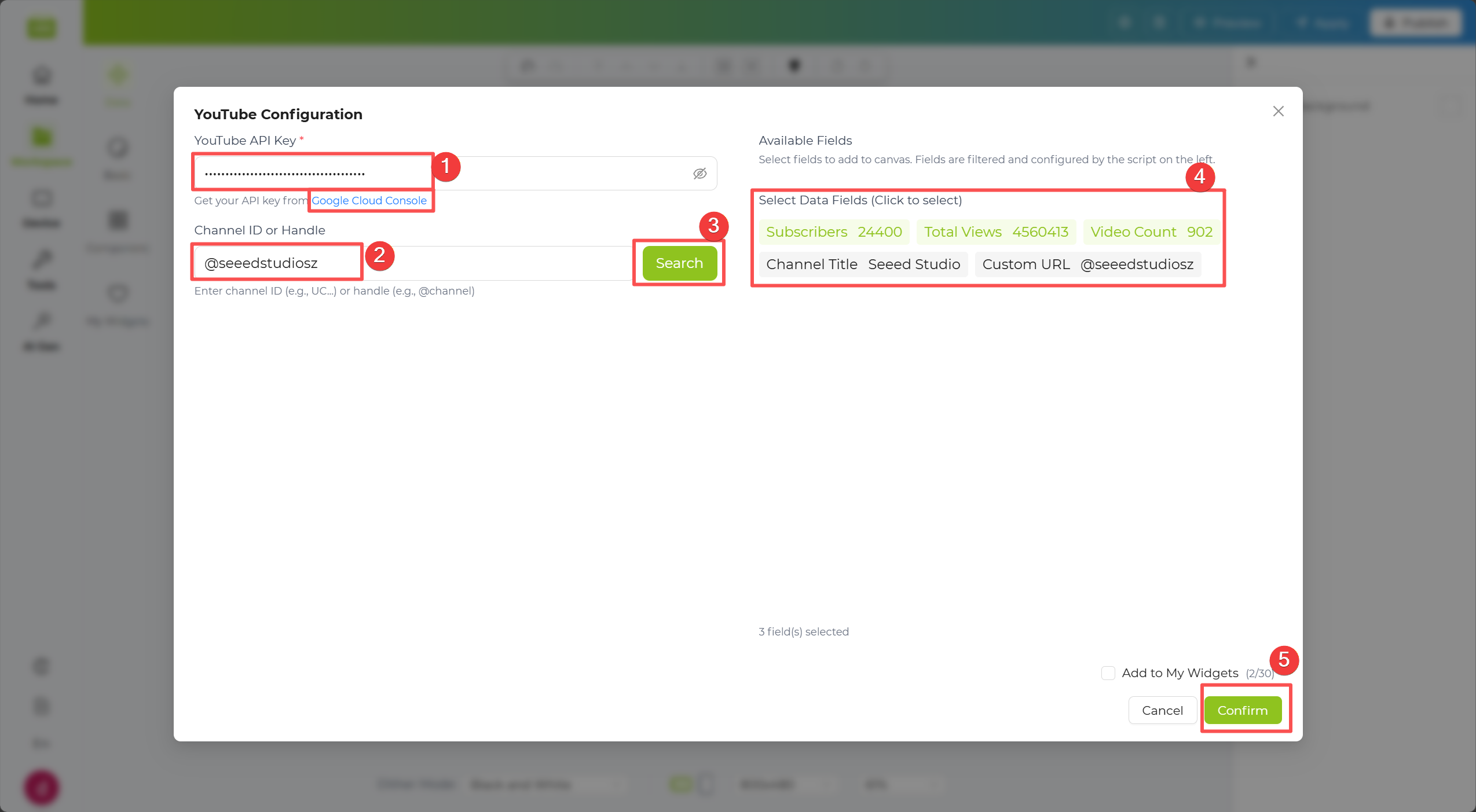
Step 4. Click the Apply button in the top-right corner of the canvas to push the data to the device.
ZenQuotes Widget
Section titled “ZenQuotes Widget”The ZenQuotes Widget lets you add inspirational quotes to your design, with optional filtering by type, author, or keyword.
Step 1. Enter your API key if available. This widget can still work in basic mode even without an API key.
Step 2. If you entered an API key, you can further refine results using Quote Type, Filter by Author, and Keyword.
Step 3. Click Load Quotes to generate a preview on the right. After reviewing the result, click Confirm to place the quote layout on the canvas.
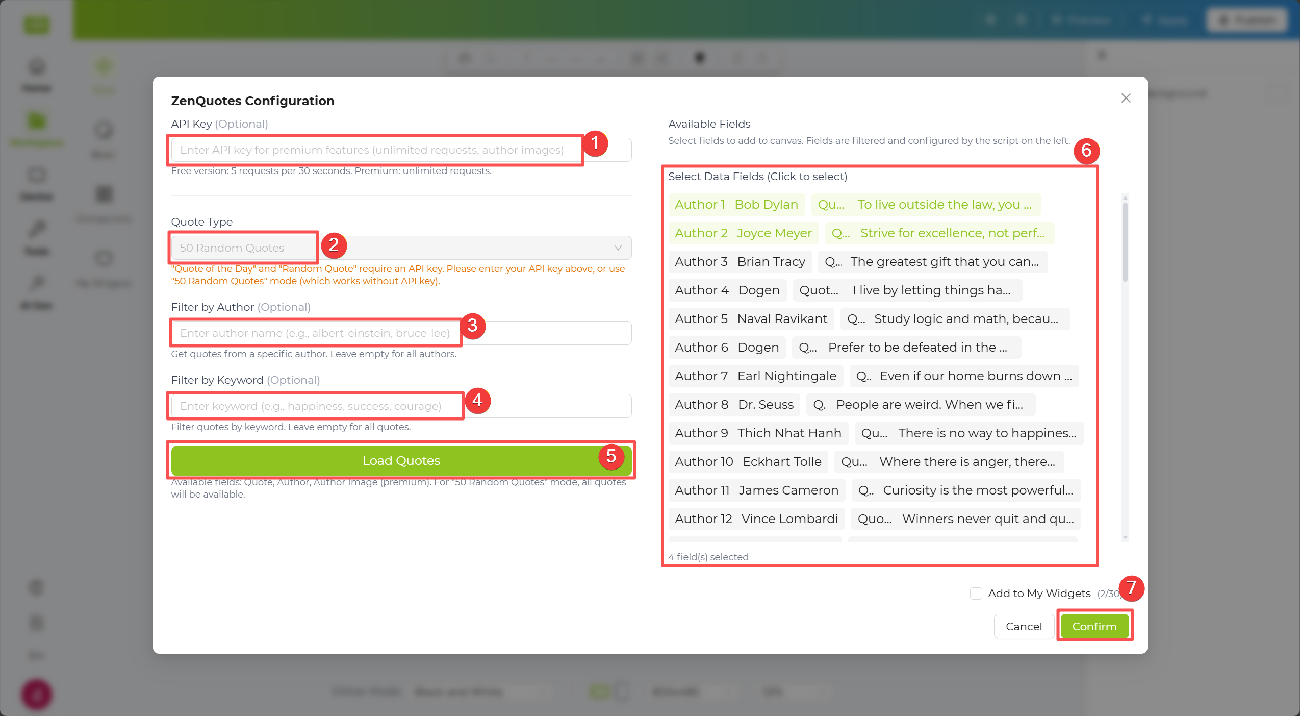
Step 4. Click the Apply button in the top-right corner of the canvas to push the data to the device.
Todoist Widget
Section titled “Todoist Widget”The Todoist Widget lets you display task data from your Todoist account, making it easy to build productivity dashboards on ePaper screens.
Step 1. Enter your Todoist API key in the first field. If you do not already have one, use the link provided in the interface to check how to obtain it.
Step 2. Optionally configure available task filters (for example, task type or query fields) based on your use case.
Step 3. Click Load All Tasks to generate a task preview on the right. After reviewing the result, click Confirm to place the task layout on the canvas.
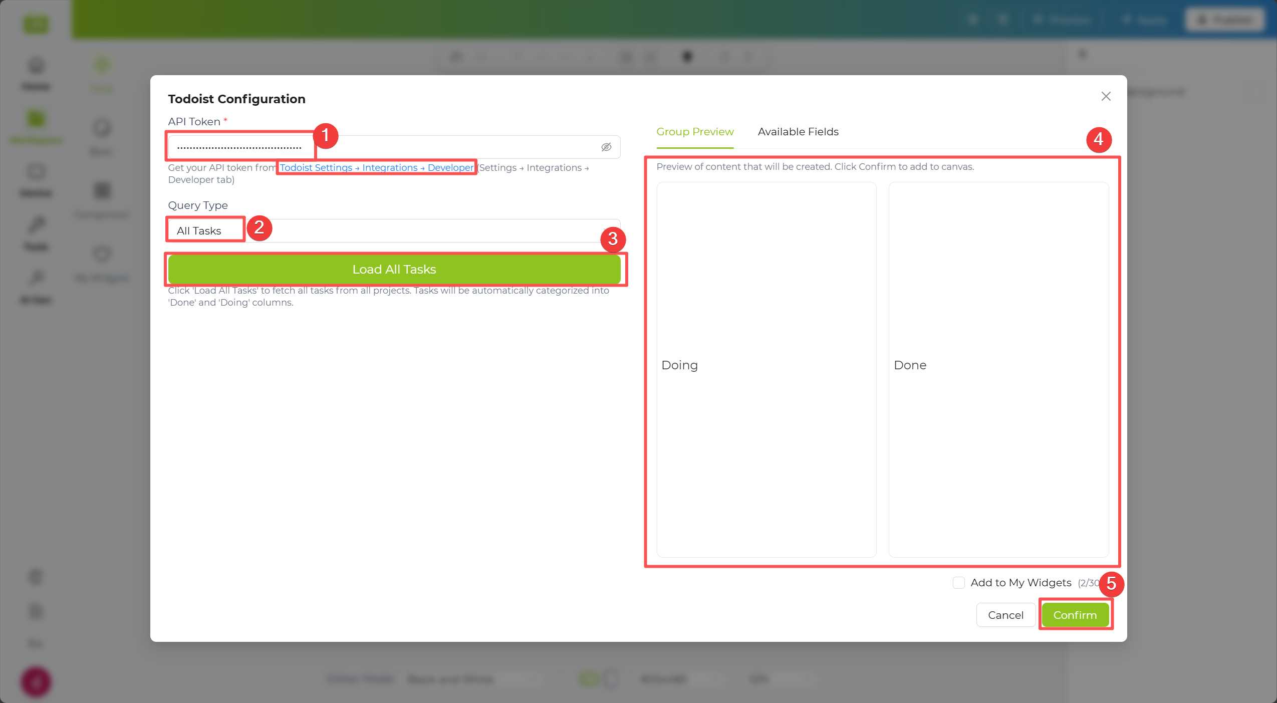
Step 4. Click the Apply button in the top-right corner of the canvas to push the data to the device.
Google Calendar Widget
Section titled “Google Calendar Widget”The Google Calendar Widget lets you display calendar events from your Google account, including event type and time-range based filtering.
Step 1. If you signed in with Google, your calendar may already be linked. You can also click Re-authorize with Google to reconnect, or click Revoke Authorization to remove access.
Step 2. Configure filters such as Event Type and Time Range to narrow down which events are displayed.
Step 3. Click Load Data to generate a preview on the right. After reviewing the result, click Confirm to place the calendar layout on the canvas.
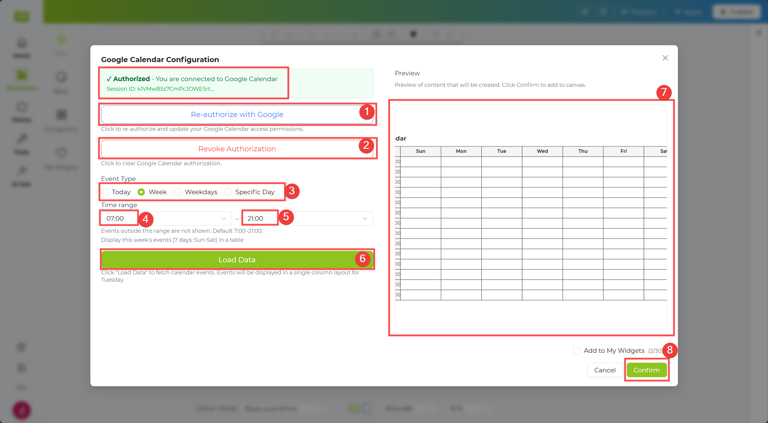
Step 4. Click the Apply button in the top-right corner of the canvas to push the data to the device.
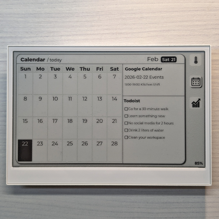
Community Templates
Section titled “Community Templates”After simple layout and style adjustments, your result can look like this community template:
RSS Widget
Section titled “RSS Widget”The RSS Widget lets you display updates from RSS feeds, such as news sites, blogs, or announcement pages. Use it when you want your screen to refresh with the latest headlines automatically, without manually updating content.
Step 1. Enter the API address (URL) from which you want to fetch data into the widget configuration box. For example:
Step 2. The system will automatically parse the data returned by the API and expand it below in a Tree Structure.
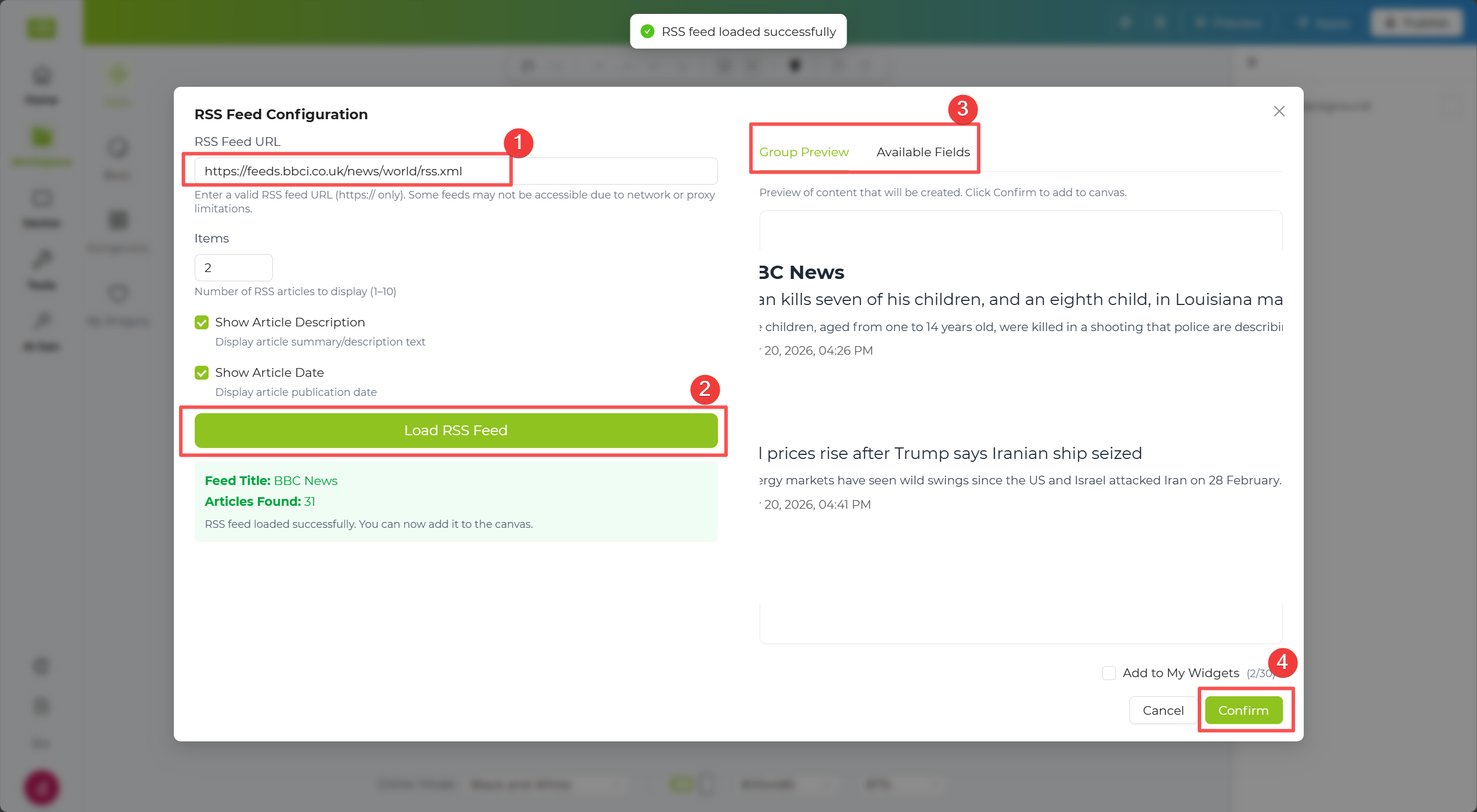
Step 3. In the tree structure, check the data fields you want to display. The selected data will automatically appear on the canvas to the right.
Step 4. Click the Apply button in the top-right corner of the canvas to push the data to the device.
HTML Widget
Section titled “HTML Widget”The HTML Widget lets you render a web page or uploaded HTML content directly on your display. Use it when you want to show a full dashboard, internal web page, or custom layout that is already built in HTML.
Step 1. Enter the API address (URL) from which you want to fetch data into the widget configuration box. For example:
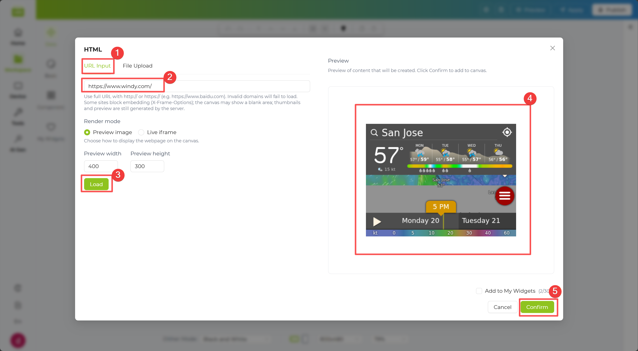
Alternatively, click File Upload to upload your own custom HTML file.
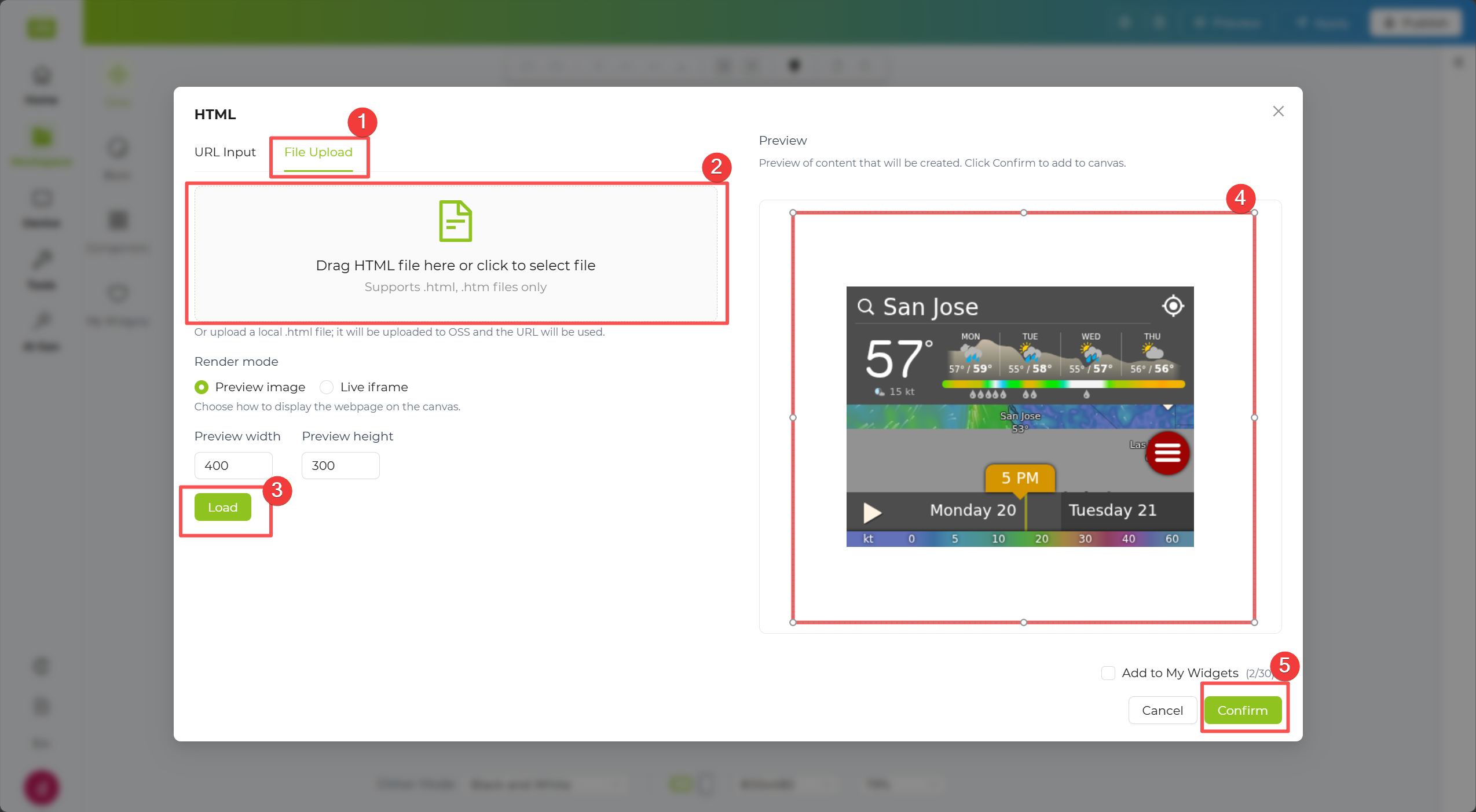
Step 2. The system will automatically parse the data returned by the API and expand it below in a Tree Structure.
Step 3. In the tree structure, check the data fields you want to display. The selected data will automatically appear on the canvas to the right.
Step 4. Click the Apply button in the top-right corner of the canvas to push the data to the device.
HackerNews Widget
Section titled “HackerNews Widget”The HackerNews Widget lets you pull story lists from Hacker News, such as Top, New, Best, Ask, Show, or Jobs. Use it when you want a lightweight tech-news panel that updates regularly with community-trending content.
Step 1. In the Data Source dropdown, select a content source such as Top Stories, Newest, Best, Ask HN, Show HN, or Job.
Step 2. In Number of Stories, choose how many items you want to load.
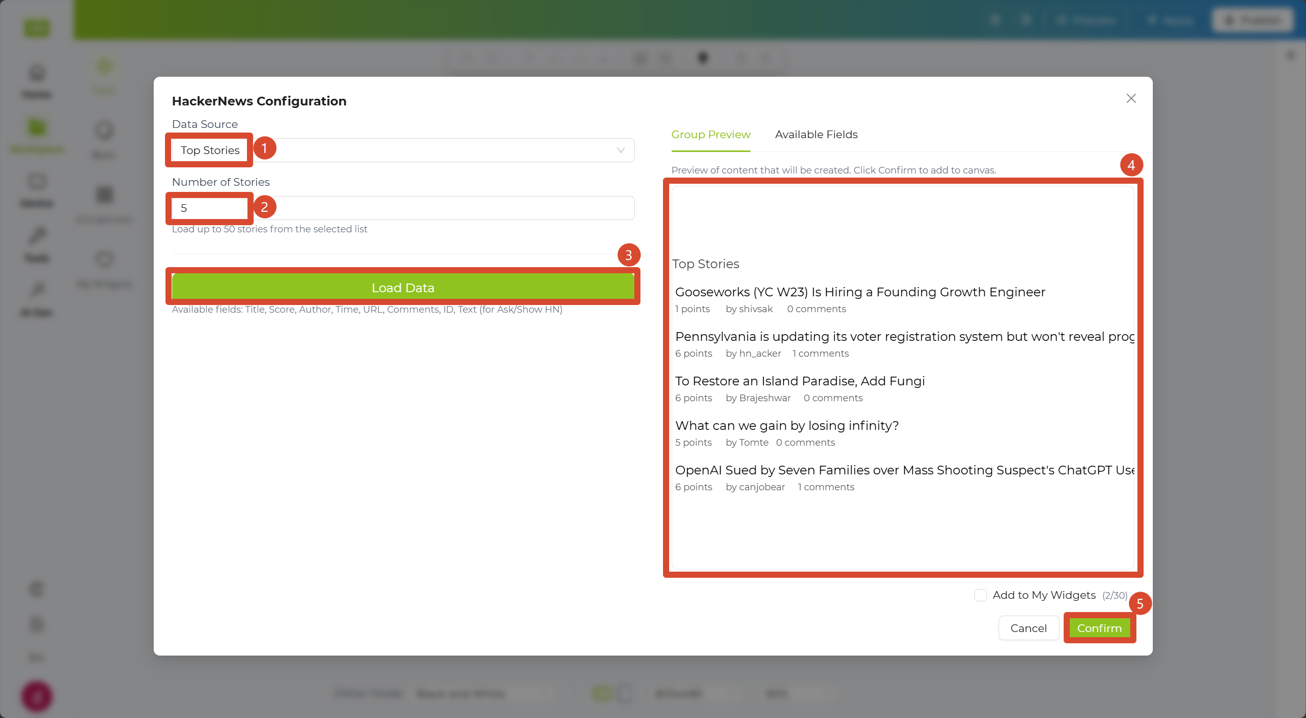
Step 3. Click the Load Data button below to generate a preview on the right. After confirming the result, click Confirm to add the content to the canvas.
Step 4. Click the Apply button in the top-right corner of the canvas to push the data to the device.
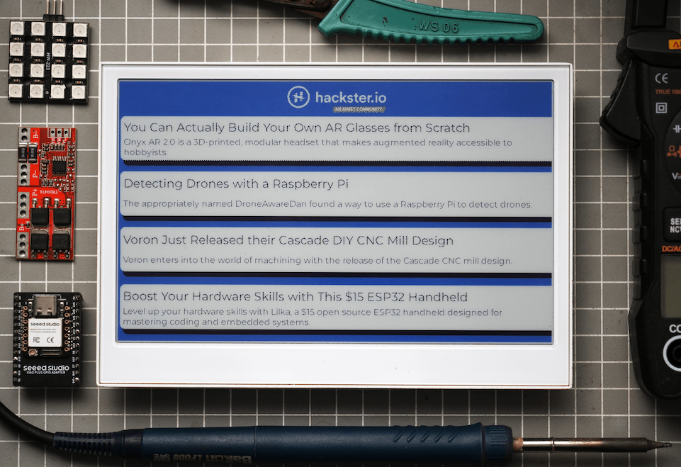
Community Templates
Section titled “Community Templates”After simple layout and style adjustments, your result can look like this community template:
Reddit Widget
Section titled “Reddit Widget”The Reddit Widget lets you display posts from a selected subreddit with your preferred sorting method. Use it when you want topic-focused updates, such as gadgets, AI, or local communities, on an auto-refreshing screen.
Step 1. In the Subreddit input field, enter the target community name without the r/ prefix, for example gadgets.
Step 2. In the Sort section, choose a sorting method such as Hot, New, Top, or Rising.
Step 3. In Number of Stories, choose how many posts you want to load.
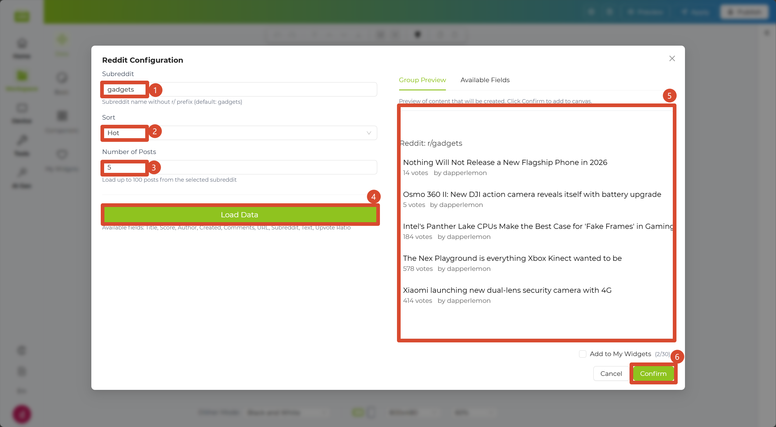
Step 4. Click the Load Data button below to generate a preview on the right. After confirming the result, click Confirm to add the content to the canvas.
Step 5. Click the Apply button in the top-right corner of the canvas to push the data to the device.
Community Templates
Section titled “Community Templates”After simple layout and style adjustments, your result can look like this community template:

External Data Source
Section titled “External Data Source”The External Data Source Widget allows you to fetch external data using APIs and visualize it on your dashboard.
Step 1. Enter the API address (URL) from which you want to fetch data into the widget configuration box.
Step 2. The system will automatically parse the data returned by the API and expand it below in a Tree Structure.
Step 3. In the tree structure, check the data fields you want to display. The selected data will automatically appear on the canvas to the right.
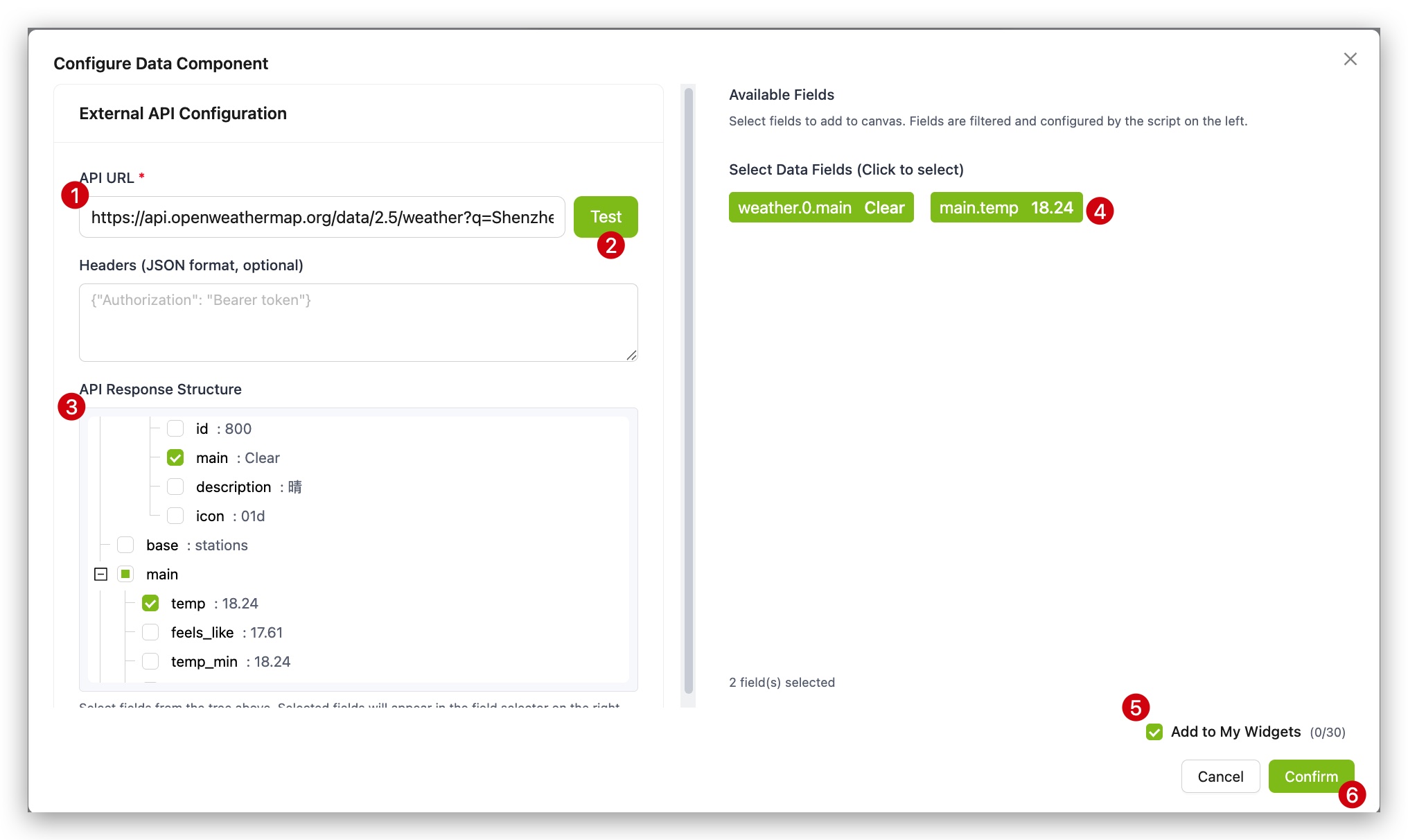
Step 4. Click the Apply button in the top-right corner of the canvas to push the data to the device.
|
|
Push Data to SenseCraft
Section titled “Push Data to SenseCraft”In addition to pulling external data, we provide the Push to SenseCraft Widget. This allows you to actively push data from your hardware program (such as Arduino or ESP32 code) to the platform.
Step 1. Ensure your device is connected to the SenseCraft platform and is actively sending data.
Step 2. Select the Push to SenseCraft Widget from Data Widgets.
Step 3. Use the demo code to test and the data will immediately appear on the canvas.
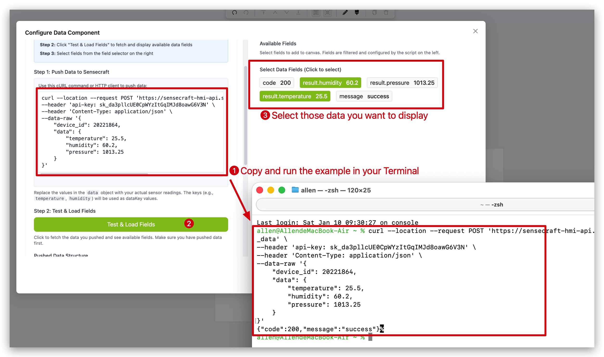
Step 4. Use basic text widgets to add labels or descriptions to the data.
Step 5. Click the Apply button in the top-right corner of the canvas to push the data to the device.
This is useful for real-time monitoring of sensor data such as temperature, humidity, and light levels.